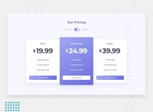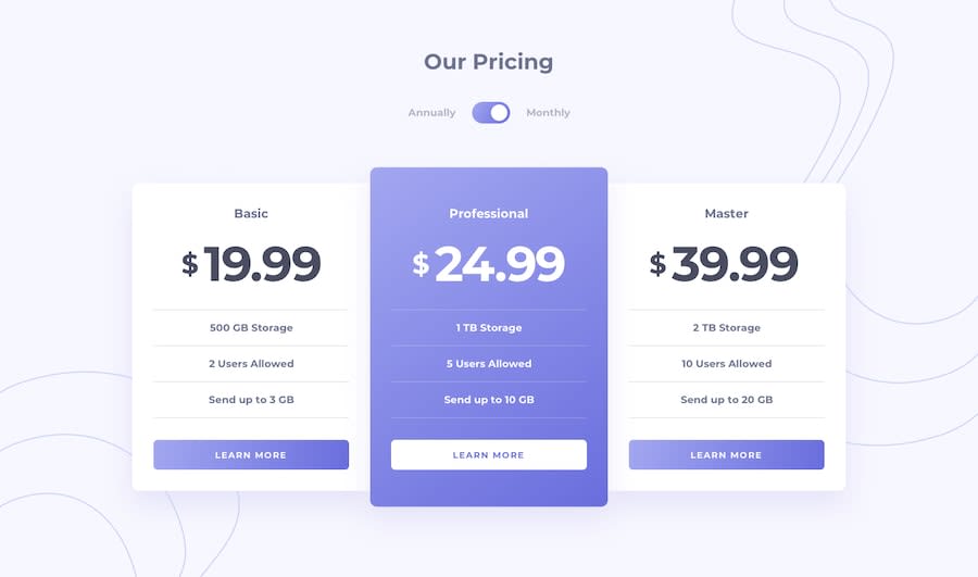
Design comparison
Solution retrospective
Hey✨ hope everyone is well!. Any feedback will be appreciated💙
Community feedback
- @ApplePieGiraffePosted over 3 years ago
Hi, Samuel Palacios! 👋
Nice to see you complete another challenge! 😀 Great job on this challenge! 👏 Your solution looks good and the toggle-switch works well! 👍
I only suggest adding some outlines to the toggle-switch and the buttons on the page so that keyboard users can easily tell when those elements are tabbed to. 😉
Keep coding (and happy coding, too)! 😁
2@samuelpalaciosdevPosted over 3 years agoHey there!
Thank you for your feedback, keep happy coding too💛
0 - @dwhensonPosted over 3 years ago
This is a lovely solution! Great work. One other suggestion is to perhaps try and improve the experience for screenreaders?
I'm not 100% sure how, but it would be nice if the toggle announced what was being toggled so that people could tell the difference. At the minute I just hear "checked" and "unchecked". I'm going to re-do my solution over the next few days and see if I can get this sorted though!
But I really like the way you have structured your HTML and CSS on this challenge. I might copy some over to mine when I re-do it!!
Cheers!
1@samuelpalaciosdevPosted over 3 years agoHey there!
What a great compliment,I will be waiting for your solution ;). Thank you for your feedback💙
0@dwhensonPosted over 3 years ago@samuelpalaciosdev I tried to improve things with radio buttons rather than a checkbox. Not altogether successful though. My attempt is here:https://www.frontendmentor.io/solutions/updated-toggle-switch-EkMLoY-Bd
0
Please log in to post a comment
Log in with GitHubJoin our Discord community
Join thousands of Frontend Mentor community members taking the challenges, sharing resources, helping each other, and chatting about all things front-end!
Join our Discord
