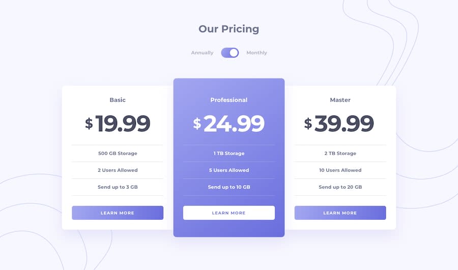
Design comparison
Solution retrospective
just tried to fit in both mobile and desktop devices. Feel free to comment if I need any improvement. Thanks :)
Community feedback
- @OlehTovkaniukPosted about 4 years ago
I would add some margin beneath all the main content. I would add a hover effect for the cards with scale effect etc. I highly suggest you to make mobile layout first - this will make the developing process much easier! More info (which have worked for me) about mobile first's benefits you can find here: https://www.youtube.com/watch?v=0ohtVzCSHqs
You have used scss variables - great. I like your css and html structure. classes names are clearly understandable. JS is clean, I like it.
Good luck in your development learning.
2@nokibrokesPosted about 4 years ago@OlehTovkaniuk Thank you so much for your feedback. :)
1
Please log in to post a comment
Log in with GitHubJoin our Discord community
Join thousands of Frontend Mentor community members taking the challenges, sharing resources, helping each other, and chatting about all things front-end!
Join our Discord
