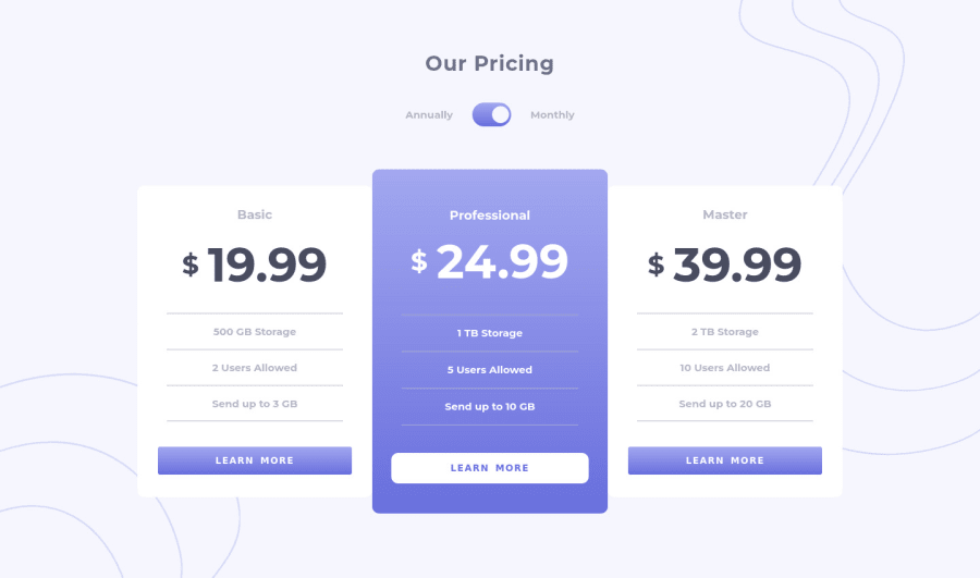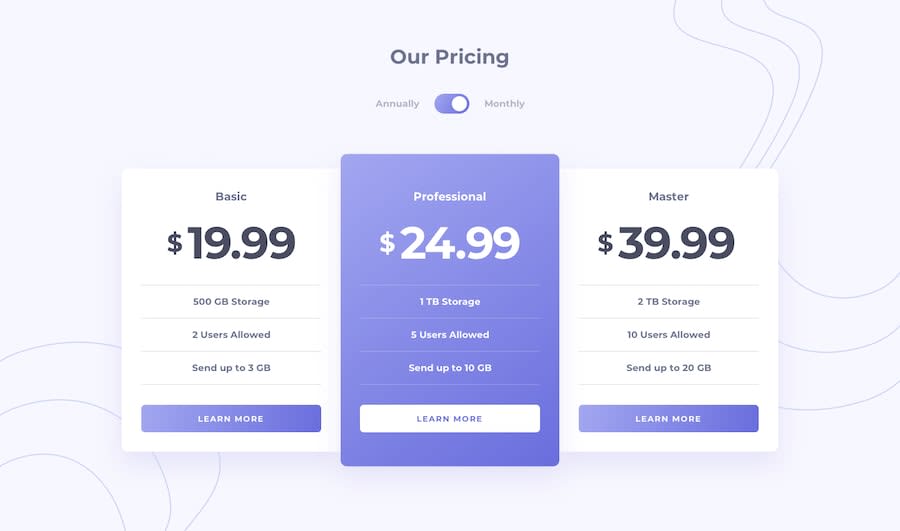
Pricing component with toggle
Design comparison
Solution retrospective
Hello, Frontend Mentor community! This is my solution to the Pricing component with toggle.
I appreciate all the feedback you left that helped me to improve this project. Due to the fact that I published this project very long ago, I am no longer updating it and changing its status to Public Archive on my Github.
You are free to download or use the code for reference in your projects, but I no longer update it or accept any feedback.
Thank you
Community feedback
- @K4UNGPosted about 3 years ago
Hey! Well done on this project. I noticed that I could only click on the circle inside of the toggle and not the toggle itself. It'd also make better sense if the toggle was a button, and not a div for accessibility. Also when I hover over the buttons, there were some shifting going on. You could prevent this by adding a border to the element. Happy Coding!
Marked as helpful2@catherineisonlinePosted about 3 years ago@K4UNG Thanks for the feedback, helped a lot. Didn't realize it was happening due to the border. You can check again now, should be fixed
1 - @jgengo-altPosted about 3 years ago
Hello Catherine 👋 good job completing this challenge. Keep up the good work 💪
🪴 Your solution looks great however I think:
🌱 • In terms of UX it would be better if your toggle button is clickable from the whole div and not only the circle
🌱 • Also, your side buttons seems to change the border-radius on hover which makes it a bit weird to the user eye.
🌱 • On wide screen it looks extremely huge, you would benefits having a container with a
max-widthHope this help and happy coding!
Marked as helpful1@catherineisonlinePosted about 3 years ago@jgengo-alt Thank you, helped a lot. I fixed the button and now it's clickable even one empty area. By side button did you mean 'learn more'? I fixed it and it's not changing size anymore.
Also, which max screen size do you think is the most common? I usually don't pay much attention after 1440px
0@jgengo-altPosted about 3 years agoHi @catherineisonline 👋
I, once, found an post in StackOverflow that was suggesting to go with a max-width of 1366px for your containers ;)
Your freshly updated version looks dope!
I hope it helps, don't hesitate to mark my comment as helpful if it was :) 💪
0@catherineisonlinePosted about 3 years ago@jgengo-alt Definitely need to look into it, thanks
0@jgengo-altPosted about 3 years ago@catherineisonline
In addition, don't hesitate to use your chrome dev tools (or firefox one) switch to responsive mode and put a custom width and height to see how your layout looks like :)
0@catherineisonlinePosted about 3 years ago@jgengo-alt Yeah, that's what I usually use
0 - @SamadeenPosted about 3 years ago
Hey Catherine!! Cheers 🥂 on completing this challenge.. . Just a subtle suggestion.. Transitions on the toggle and buttons would be nice . Regardless you did amazing.. Happy coding!!!
0@catherineisonlinePosted about 3 years ago@Samadeen Thanks for the advice
0 - @nikeshnaikPosted about 3 years ago
The Design is super perfect.
Doesn't
innerHTMLreconstructs the DOM and thus lose the event listeners?0@catherineisonlinePosted about 3 years ago@nikeshnaik Thanks! After each change I reset everything back by using setInterval and also the event itself is triggered by clicking on button and it's HTML element isn't being changed, only switches a second class - annual and monthly.
1 - @shawkysobhyPosted about 3 years ago
amazing ,but how you can make pixel so perfect like that
0@catherineisonlinePosted about 3 years ago@shawky55 Thank you, I use Chrome extension called Perfect Pixel as well as Figma
0 - @DanteiePosted about 3 years ago
How do u make so perfect sizes do you eyeball it or u use some tools. Sorry my English is not so great
0@catherineisonlinePosted about 3 years ago@Danteie I use Chrome extension called Perfect Pixel as well as Figma
0
Please log in to post a comment
Log in with GitHubJoin our Discord community
Join thousands of Frontend Mentor community members taking the challenges, sharing resources, helping each other, and chatting about all things front-end!
Join our Discord
