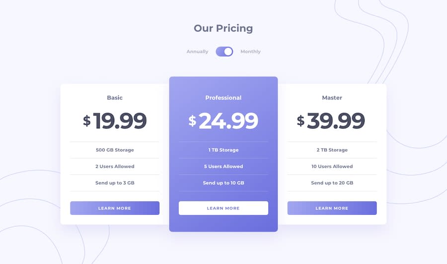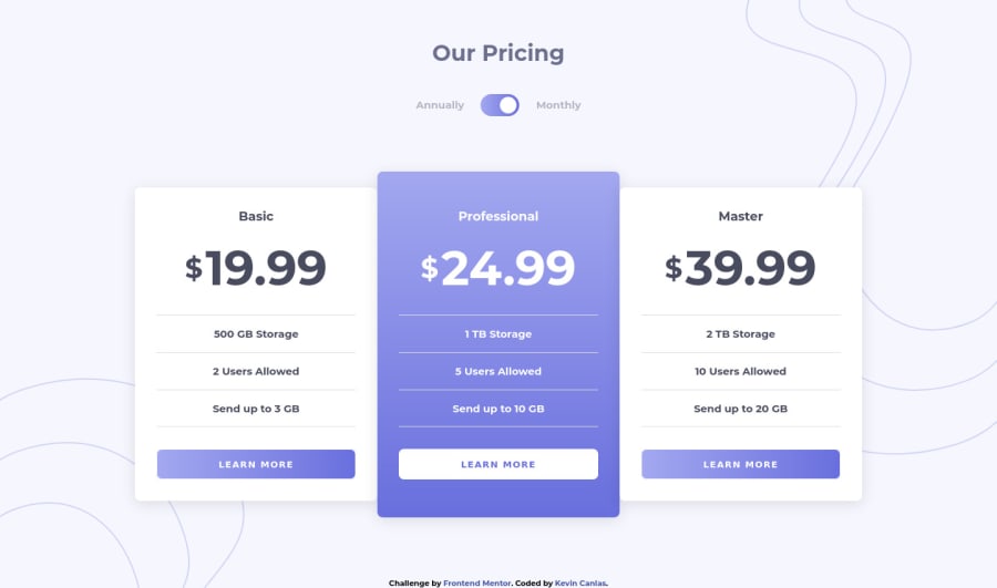
Design comparison
Solution retrospective
Please critique my work! :D I'm trying to write cleaner code, so if anyone has any tips on being more efficient, I'm all ears!
Community feedback
- @Yazeed-gitPosted almost 4 years ago
Nice html structure and overall clean code, I think the transition on the primary card button is cool the one on the secondary_card's button though, i think, can be improved, or made similar to the primary. Overall Great Job!
1@kvncnlsPosted almost 4 years ago@Yazeed-git Thank you Yazeed! Yes, I saw the weird issue with the secondary button's transition. I'm not sure what it is, but it's the EXACT same code as the primary, just with different colors. I can't figure out why it looks strange. I'll more more into it!
0 - @ApplePieGiraffePosted almost 4 years ago
Hey, Kevin Canlas! 👋
Great job on this challenge! 👍 Your solution looks good, responds very nicely, and the toggle-switch works well! 👏
I suggest,
- Making the toggle-switch tabbable so that keyboard users can access and use that toggle-switch. Adding a focused state to the toggle-switch and the buttons on the page would be a good idea, too, so that users can easily tell when those elements are selected.
- Adding a little more space (using margin or padding) between the design and the top and bottom of the page in the desktop layout so that there is always some room between the two even when the screen height decreases.
As usual, keep coding (and happy coding, too)! 😁
1@kvncnlsPosted almost 4 years ago@ApplePieGiraffe Thanks APG! Sorry for the late reply, been busy lately! I'll get to it!
0
Please log in to post a comment
Log in with GitHubJoin our Discord community
Join thousands of Frontend Mentor community members taking the challenges, sharing resources, helping each other, and chatting about all things front-end!
Join our Discord