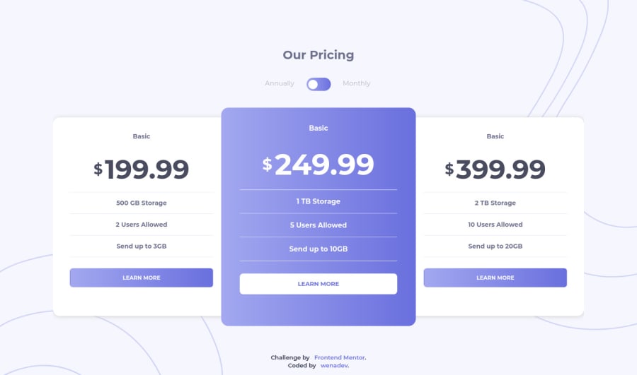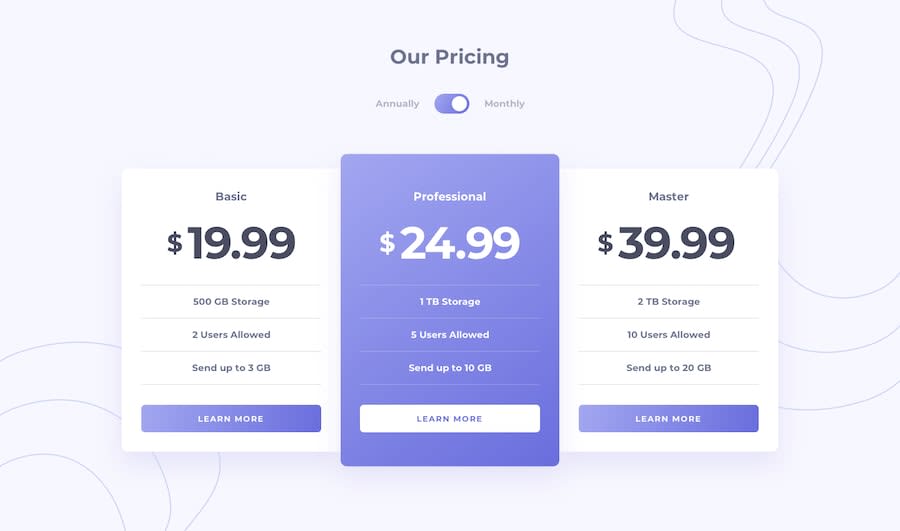
Design comparison
Solution retrospective
Please share your thoughts.
Community feedback
- @ApplePieGiraffePosted about 4 years ago
Hello, wenadev! 👋
Nice to see you complete another challenge! 😀 Your solution looks good and is responsive! 👍
A few things I'd like to suggest are,
- Adding a
max-widthto the pricing cards to prevent them from becoming too wide when the layout first changes from desktop to mobile. - Making the toggle-switch tabbable so that keyboard users can access and use that switch. 😉
Keep coding (and happy coding, too)! 😁
1 - Adding a
- @NocksPosted about 4 years ago
Also, the bottom background Only shows when on desktop. It doesn't display when in mobile view.
You also want to update the "Challenge by" link in the footer to the link of the project page. This way people can conveniently see the challenge details just by a click.
0@wenadevPosted about 4 years ago@Nocks Hi! Thank you for your suggestions but the bottom background is showing on my end. Effected the rest of the changes :))
0 - @NocksPosted about 4 years ago
Hey Wenadev! Good one there.
By the way, each of your packages is displaying "Basic".
0
Please log in to post a comment
Log in with GitHubJoin our Discord community
Join thousands of Frontend Mentor community members taking the challenges, sharing resources, helping each other, and chatting about all things front-end!
Join our Discord
