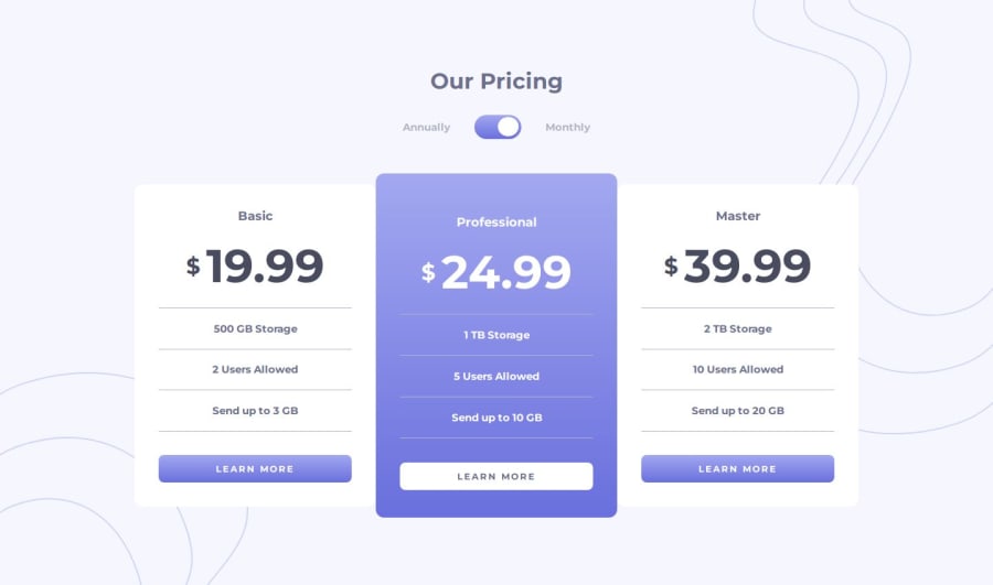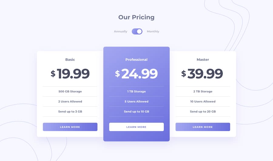
Design comparison
Community feedback
- @MarziaJaliliPosted 3 months ago
Great job finishing the project!!!
Some tiny tips for a more improved design
First, the size and position of the price and the dollar sign differ. It needs some minor adjustments.
-
To match the design, you wrap a
<span>element for the dollar sign and a<strong>element for the price in another <span> in each card. -
Then, add a
displayofflexandalign-items: center;to the parant<span>.
In addition, when the user hovers over a button the card resizes. I assume it is caused because there is no border initilaly, it's added when it is hovered.
- To prevent this, you could set the border first in the buttons' selectors not in the
:hoverselector. You could put the initial color of thebordertotransparntif needed.
Other than that, your web is on fire!!!!
hope the feedback was helpful, for more clarity you can check out my solution as well😁😁.
Marked as helpful1@Talika-BajajPosted 3 months agoHi @MarziaJalili,
Thank you for reviewing my solution. I will surely update my code keeping in mind your advice and will also take a look at your solution.
Thank you once again :)
1 -
Please log in to post a comment
Log in with GitHubJoin our Discord community
Join thousands of Frontend Mentor community members taking the challenges, sharing resources, helping each other, and chatting about all things front-end!
Join our Discord
