

Design comparison
SolutionDesign

Solution retrospective
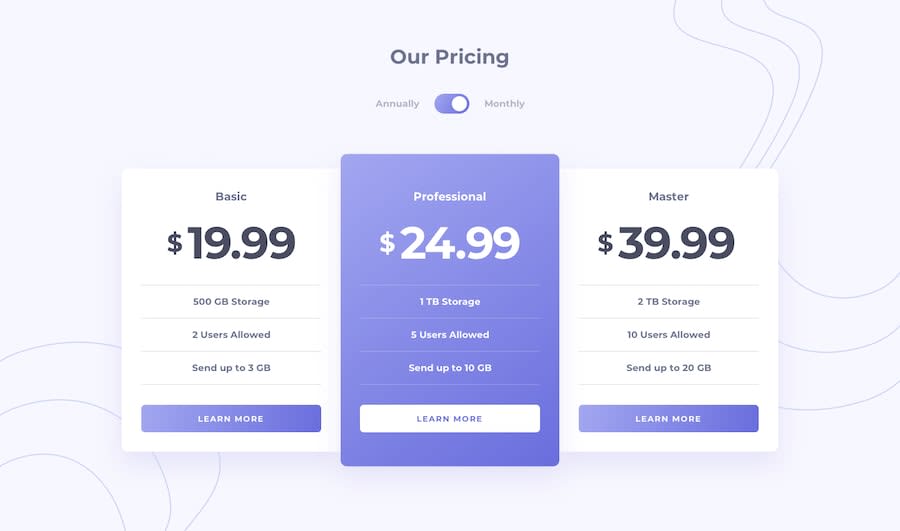
check out my new Pricing component with toggle solution feedback and suggestions are welcomed
Community feedback
- @pikapikamartPosted about 3 years ago
Hey, really great work on this one. Desktop layout is great, it is somehow responsive but I think 1000px for mobile state is too early too big, desktop layout could use more of those, however mobile layout looks great.
Some other suggestions would be:
bodytag does not needwidth: 100%since by defaultblockelement uses 100% of the width. Same with themain.- Avoid using
vhunit in theheightproperty as this is not consistent and only uses the remaining viewport screen. Try seeing the site on dev tools at the bottom, hover on thebodytag, you will notice it doesn't occupy the whole layout because of thevhunit. Usereminstead or just let the padding/margin of the element define the whole layout's size. - Avoid using multiple
h1on a page, use only at least 1 per page. - On the toggle section, a proper markup on this is to use 2 radio buttons, the two text on the sides are the
labelfor their respective radio buttons. Now this setup is a bit trickier to do, have a look at Grace's solution for this one. You will a proper markup on it. Also if you want, I have a simple snippet as well that uses the same markup on that one, this is the sample snipptet here you can tweak it and learn about the structuring. - Avoid using
idattribute as a selector in css because it is a bad practice due to css specificity. Useclassto target elements. - Those 3 items on each card, the text that are sandwiched on a horizontal lines, you should have used
ulon those since those are "list" of information about the respective plan that the user will choose. You can see more about the proper markup on the link that I attached with Grace's solution.
Lastly, just go through her solution and if you have any queries, just let me know in here okay. Again, great job on this one.
Marked as helpful1@GauravkumarioPosted about 3 years ago@pikamart thank you for feedback. I liked your suggestions and your explanation. I will try to make more reliable projects.
1

Please log in to post a comment
Log in with GitHubJoin our Discord community
Join thousands of Frontend Mentor community members taking the challenges, sharing resources, helping each other, and chatting about all things front-end!
Join our Discord