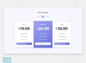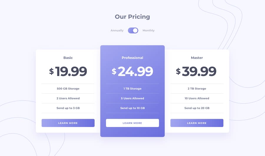
Design comparison
Community feedback
- @beatrizalmeidapiresPosted over 4 years ago
Hi Sheri! Your solution looks great. The only little thing I would improve it the dollar sign which should be smaller than the price itself.
How do you make the height of the page exactly the same as the design? I can never get it the right height.
Keep going!
1@shericodesPosted over 4 years ago@beatrizalmeidapires Thank you very much for the feedback. I kept thinking that something was a bit off but I couldn't figure out what it was.
How do you make the height of the page exactly the same as the design? I can never get it the right height.
Whenever the content of a page is smaller than the browser's height and I want it to take up the entire height, I set a minimum viewport height of 100 on the body.
body{
  min-height: 100vh;
}
Then, I use flexbox to center the main container on the page.
1
Please log in to post a comment
Log in with GitHubJoin our Discord community
Join thousands of Frontend Mentor community members taking the challenges, sharing resources, helping each other, and chatting about all things front-end!
Join our Discord
