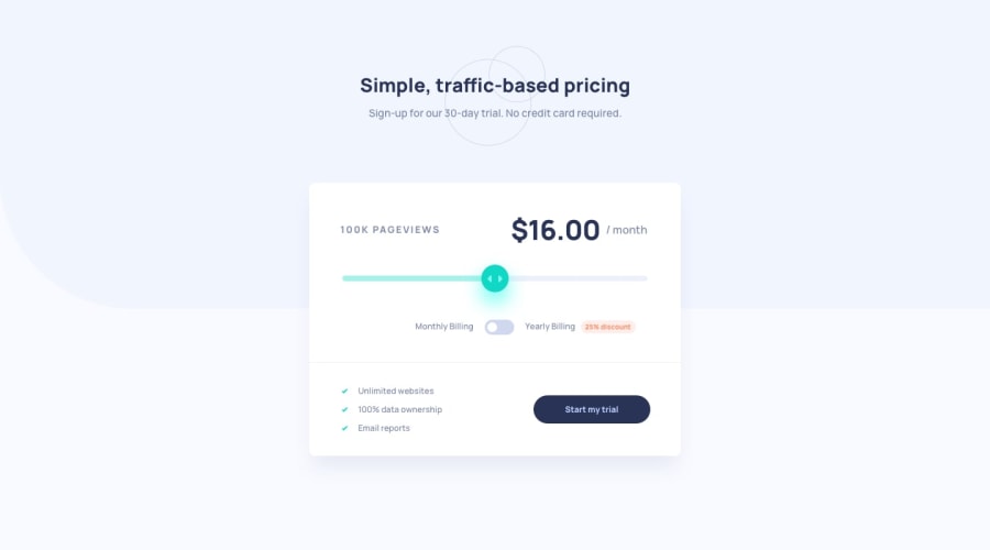
Design comparison
Solution retrospective
Built the component using sass, bootstrap, clamp for font sizes, used netlify for deployment. This is a small component so tried using webpack and it was not that easy for me to setup. Took most of the time to setup webpack and understanding the slider, shadow dom to make it work on different browsers. Tested on Firefox, Brave, Chrome and Opera and it works fine.
Any comments for improvement are highly appreciated.
Community feedback
- @dwhensonPosted over 3 years ago
Hello @santu369 this is is great stuff! 🙌 The component responds really nicely, you've got all the functionality working well, and nice focus styles too. I can operate everything with my keyboard - really nice!
Some very small issues:
-
I wondered whether using some styled radio buttons might be more appropriate than a
buttonfor the yearly/monthly toggle? This would then announce what option had been selected - this is not working at the moment. -
You might also want to have a play around with adding
aria-live="polite"to the element where the price is changing - this may also help the price get announced - but honestly, that whole slider thing looks tricky to me!!
As I said, small issues, but might be worth having a think about. Great work!!
Cheers 👋
Marked as helpful2@santu369Posted over 3 years agoHi @dwhenson ,
Thanks for the suggestions. Will definitely look into these and try to update the solution.
Happy Coding 🙌.
0 -
Please log in to post a comment
Log in with GitHubJoin our Discord community
Join thousands of Frontend Mentor community members taking the challenges, sharing resources, helping each other, and chatting about all things front-end!
Join our Discord
