Not Found
Not Found
Not Found
Not Found
Not Found
Not Found
Not Found
Not Found
Not Found
Not Found
Not Found
Not Found
Not Found
Not Found
Not Found
Not Found
Not Found
Not Found
Not Found
Not Found

Submitted

Pricing component with SASS

@promathieuthiry

Desktop design screenshot for the Pricing component with toggle coding challenge

This is a solution for...

  • HTML
  • CSS
  • JS
2junior
View challenge

Design comparison


SolutionDesign

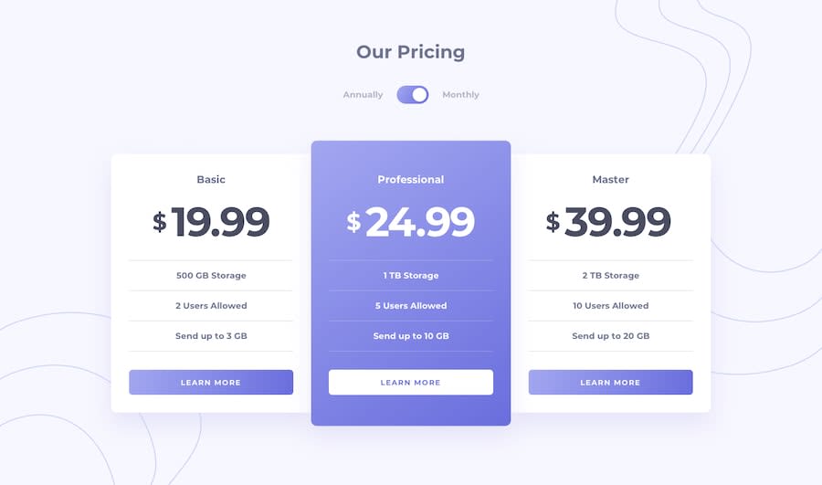
Solution retrospective


Any feedback would be great. I did not succeed to display the background image at the top right in mobile. I used js to toggle, any suggestion in only html / css would be helpful

Community feedback

@pikapikamart

Posted

Hey, great work on this one. Layout in desktop is good, as well as the mobile. Transitioning though, at point between 990px - 860px, the layout is being hidden thus creating a horizontal scroll. The functionality also works just fine.

Some suggestions:

  • Since, this is like a one component, I wouldn't use header tag and instead there will be main tag that wraps the whole content.
  • Always include atleast 1 h1 per page. On this one, it could be the "Our Pricing" text, or you can make a screen reader only h1 that describes the content and h2 for the "Our Pricing". Either one could be great.
  • The "annually" and the "monthly" should be a label for the toggler. So that a user can click either "annually" or "monthly". However, I didn't use it this way since I used radio button for my solution long before. I used radio button because it is a selection of choices, and radio buttons are intended for those.
  • The name of the pricing like "basic" along with their respective pricing could be wrap inside their own heading tag like h2. This makes it clear for a screen reader user on what is the price of such pricing names.
  • The informations like these ones "500 GB Storage, 2 Users Allowed, Send up to 3 GB" could be wrapped inside a li element, inside of a ul. Since those are list of informations regarding the subscription, a ul is fitted for it.

Other than those, really great work. Also you can drop any question if you have.

Marked as helpful

0

@promathieuthiry

Posted

Yeah I am learning sass and I will use this feature for my next project. That is cleaner, it's a little bit hard to apply right away but I will refactor next time.

0

@promathieuthiry

Posted

Hi thanks a lot for your reply, it is very helpful. That is the first time i receive a deep review.

  • Indeed, I changed the media query so i don't have anymore horizontal scroll.
  • Yeah I don't pay attention to html tag and I should pick them more carefully.
  • Oh yeah i modified my code so the user can click either "annually" or "monthly". It makes more professional.

I wonder if you use the BEM methodology? I am looking to structure more my code. Thanks

0

@pikapikamart

Posted

@promathieuthiry Great, glad to be at of help.

Also for bem, yep I use bem as my main guide when creating selectors and specially stylings and it really creates more meaningful selectors and logical hierarchy in the stylings. Along with scss on it makes it more really good.

I saw that you are using scss, but you are not nesting selectors . With bem on top of this, you won't be dealing with typing the full selector names.

Like for example this snippet

<section class="hero">
  <div class="hero__container">
    <h1 class="hero__heading"> I am a heading</h1>
  <div>
 <div class="hero__container hero__container--large">
    <div class="hero__image-holder">
      <img class="hero__image" />
    </div>
  <div>
<section>

Something like that. Also, if you saw for example a layout on the design, that looks similar. You can make a selector on that so that you could reuse in in another section that uses that kind of layout.

For scss Instead of targeting selectors like:

.hero {}
.hero__container{}
.hero__image{}

It would be like:

.hero {
  
  &__container{}

  &__container{}
}

Using & on a nested selector, takes the parents name as its placeholder. Meaning the & means hero and combined &__container means hero__container

Marked as helpful

0

@promathieuthiry

Posted

@pikamart hey I went through your github and I found your code really well structured. That is inspiring me. I try to make my design as much as as responsive using the latest css features and avoiding as much as possible media queries. I noticed your use clamp() but I still struggle to understand how to pick the preferred value (the middle value). You use often in vw but how do you determine this value? That would be very helpful if you can give your tips. My discord @Mathieu T

0

@pikapikamart

Posted

@promathieuthiry Hey, I don't have any discord account? Maybe slack, I can dm you with and help with that, how about that

0

@promathieuthiry

Posted

@pikamart yeah iam in the frontend mentor slack. My username is @promathieuthiry

0

Please log in to post a comment

Log in with GitHub
Discord logo

Join our Discord community

Join thousands of Frontend Mentor community members taking the challenges, sharing resources, helping each other, and chatting about all things front-end!

Join our Discord