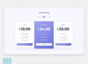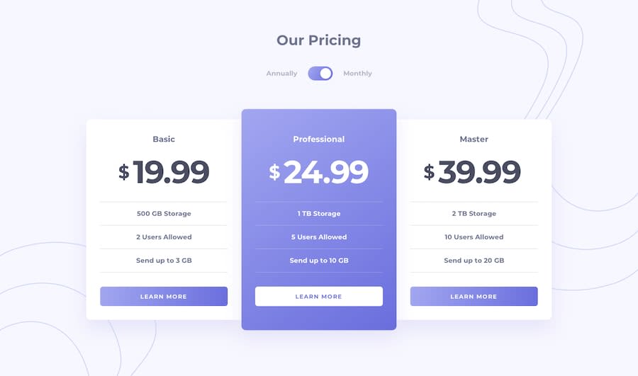
Pricing Component using SCSS and Vanilla Javascript
Design comparison
Solution retrospective
No specific questions, but feedback is always appreciated! :)
Community feedback
- @tomthestromPosted over 3 years ago
Hey Nicole,
I was looking at your JS code. It's nice and readable, just a few things that are mostly a matter of taste.
This whole code could be wrapped in an
IIFEto avoid polluting the global namespace. It's a basic app and does no harm doing it the way you do, but it's a good practice to think if you really need to have globals before using them (build good habits from the beginning).let monthlyPriceandlet annualPriceshould beconst, they are not reassigned anywhere.const toggle = document.querySelector("#toggle");could be agetElementById, it tells better what you're doing sincequerySelectoris more of a general tool.querySelectorAllbased on class names are not the best, it's a better practice to usedataattributes, again at this scale of an app it doesn't matter that much, just something to be aware of.toggle.addEventListener("click", function () { if (toggle.checked) { for (i = 0; i < annualPrice.length; i++) { annualPrice[i].style.display = "none"; } for (i = 0; i < monthlyPrice.length; i++) { monthlyPrice[i].style.display = "block"; } } else { for (i = 0; i < annualPrice.length; i++) { annualPrice[i].style.display = "block"; } for (i = 0; i < monthlyPrice.length; i++) { monthlyPrice[i].style.display = "none"; } } });This could be shortened for readability and to reduce repetitiveness to:
toggle.addEventListener("click", function () {
    for (i = 0; i < annualPrice.length; i++) {
      annualPrice[i].style.display = this.checked ? "none" : "block";
    }
    for (i = 0; i < monthlyPrice.length; i++) {
      monthlyPrice[i].style.display = this.checked ? "block" : "none";
    }
});
You could also use
Array.map()orArray.forEach()instead of thoseforloops to make it more declarative.Your github repo shouldn't include the
.DS_Storefile and thepackage-lock.json.Have a good day,
Tom
0 - @samuelpalaciosdevPosted over 3 years ago
Hi, Nicole👋
Well done on this challenge! Your solution looks good and it scales pretty well👍
I only suggest some things 😉:
-
Adding a transition to the toggle. I'd add a
transition: .5s;on the#toggle::afterelement, it make it feel more smooth. -
You don't have a h1 on this project as it stands. Having your headings on order is not really a rule, but the h1 it's one of the most important tags on an webpage . For this project, it would be where you've got the h5 heading.
I hope this would help you, have a nice day, keep coding!💙
0 -
Please log in to post a comment
Log in with GitHubJoin our Discord community
Join thousands of Frontend Mentor community members taking the challenges, sharing resources, helping each other, and chatting about all things front-end!
Join our Discord
