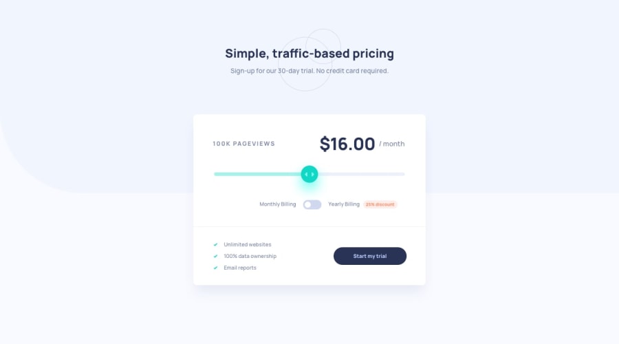
Pricing Component using React, Vanilla Extract and custom UI controls
Design comparison
Solution retrospective
This one was a lot more challenging than it looked. There are a lot of little details, and getting the custom controls to still be accessible was a lot of work. I think it was mostly successful though.
There are a couple of problems of overflow here - the toggle labels wrap awkwardly on small screens, and I had to brute-force overflow: hidden on the form because the custom slider ends up doubling in size. Couldn't figure out how to do that one better. If anyone has any ideas on that, I'd love to hear.
Community feedback
- @mattstuddertPosted about 3 years ago
Excellent work on this challenge, Alex! You've written a great
README.mdas well. I didn't actually know about theoutputelement! I've always usedaria-livefor announcing content changes to screen reader users, but I like the idea of using a native HTML element for that task.I see what you mean about the toggle labels and layout issues on small mobile screens. I couldn't find any fixes from the short time I spent playing around in inspector, unfortunately. This is one of those instances where you'd typically sit with the designer and see what they'd be happy with. You'd then spend many hours fiddling around with it to get it looking right! 😅 I've been in this type of situation many times. Perhaps one of the other solutions to this challenge has a good solution, so it might be worth browsing around.
Keep up the great work. It's awesome to see you so focused on building accessible interfaces! 🙌
Marked as helpful1 - @zineb-BouPosted about 3 years ago
Your solution looks amazing, I just noticed small detail, the top heading need some margin-bottom on the desktop screen.
Marked as helpful0
Please log in to post a comment
Log in with GitHubJoin our Discord community
Join thousands of Frontend Mentor community members taking the challenges, sharing resources, helping each other, and chatting about all things front-end!
Join our Discord
