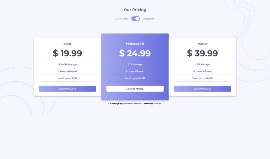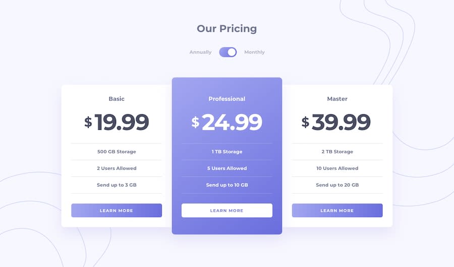
Design comparison
Solution retrospective
Any feedback or suggestions would be helpful
Community feedback
- @benjoquilarioPosted over 3 years ago
Hi pranav1597! Nice job on finishing this one, It looks good and response very well
My only suggestion is to add the
cursor: pointer;on toggle button to make looks good and to inform the user that this is clickable, and also add max-width on container so that they don't become too wide and so that the content inside them doesn't drift apart on extra-large desktop screens.try to add like on your
containerclassmax-width: 1100px;width: 100%;margin: 0 auto;Keep coding and happy coding too! keep it up!
Marked as helpful0@pranav1597Posted over 3 years ago@benjoquilario Okay, thanks for the help. Happy coding :)
0@benjoquilarioPosted over 3 years agoHi @pranav1597, sorry for the late reply your project is already good :) Keep coding
0
Please log in to post a comment
Log in with GitHubJoin our Discord community
Join thousands of Frontend Mentor community members taking the challenges, sharing resources, helping each other, and chatting about all things front-end!
Join our Discord
