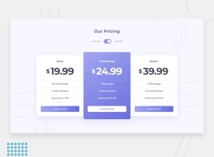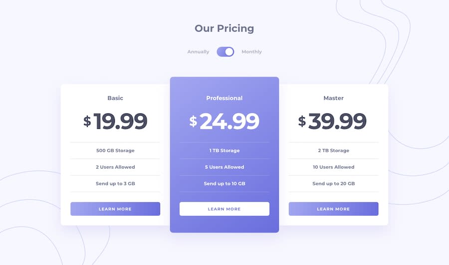
Design comparison
Solution retrospective
Hello reader friend, this is the project that I did today, the truth is that it is not difficult and I recommend you to do it, believe me, you will enjoy it.
Community feedback
- @elaineleungPosted over 2 years ago
Hi David, well done on this challenge; I also recently completed it, so it's nice to check out how other people worked on it! 😊
I think the only thing I see here is that at around the 1000px to 600px breakpoint range, the content is covered by the browser as the browser window shrinks, and it looks like the cards aren't as responsive. That might have something to do with the
widthandmin-widthproperties on your card (which are really close in value); I'd suggest removing those, and try something likewidth: min(100%, 35rem)so that the card can stretch and shrink. If you do that, you may also need to put awidth: min()on the.cardsgrid to prevent it from getting too big and breaking off.Marked as helpful1@dvcode01Posted over 2 years ago@elaineleung Hi Elaine, thank you so much for giving me such good feedback. I am going to make the necessary changes during this week, and finally I would like to tell you that I am also happy that you have also been able to complete this challenge.
1@dvcode01Posted over 2 years ago@elaineleung Hello again Elaine, I hope you are well. I followed a bit your recommendations regarding the design of the challenge and made some changes. Again I take the opportunity to thank you for mentioning my mistakes on time so I can correct them.
1@elaineleungPosted over 2 years ago@dvcode01 You're welcome, David, glad I could help!
1
Please log in to post a comment
Log in with GitHubJoin our Discord community
Join thousands of Frontend Mentor community members taking the challenges, sharing resources, helping each other, and chatting about all things front-end!
Join our Discord
