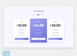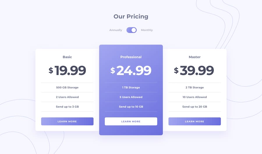
Design comparison
SolutionDesign
Solution retrospective
Kindly provide suggestions so that i can improve the design further
Community feedback
- @adarshcodesPosted over 4 years ago
Hi! @prnachap, your solution to this challenge looks fine, few changes you can make
- you can add padding to the toggle.
- the box-shadows are looking odd to make it smooth.
- solve the HTML issues. Great work👏
2@prnachapPosted over 4 years agoThanks you for your feedback, I have removed the box-shadows, i will rectify issue relating to html and toggle button. Thanks again :)
0
Please log in to post a comment
Log in with GitHubJoin our Discord community
Join thousands of Frontend Mentor community members taking the challenges, sharing resources, helping each other, and chatting about all things front-end!
Join our Discord
