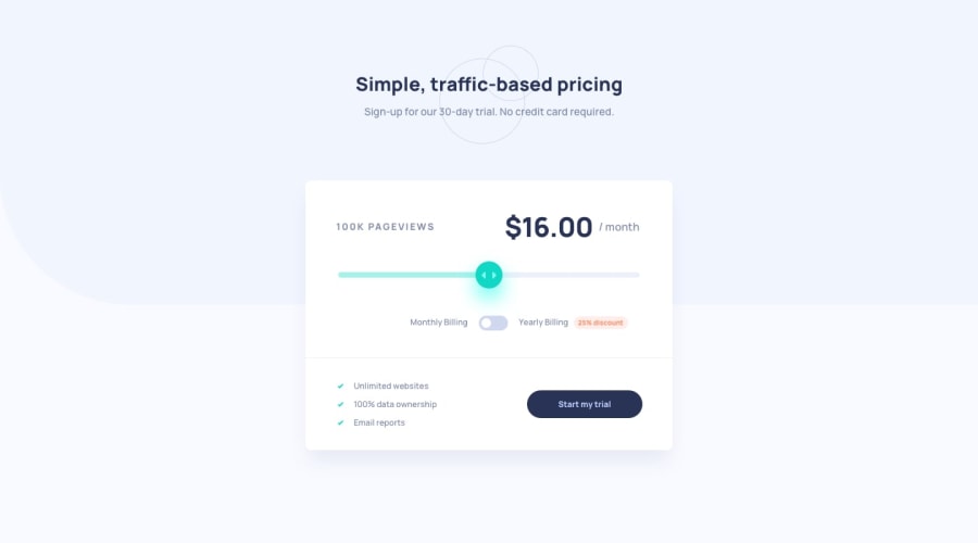
Pricing component - HTML, SCSS, JS, Flexbox, Grid, BEM & mobile-first!
Design comparison
Solution retrospective
Hi everyone 👋
Wow what a challenge - I took my time with this one and finally relinquished the desire to complete as many challenges as I can in as little time as possible.
I probably learnt the most from this one project than all the others so far. Forcing myself out of tutorial hell, I didn't copy and/or use code I didn't understand and I used google/MDN to work through the solution however difficult or time consuming.
It was worth all the effort.
🐛 However I do have one little bug to squish - the discounted price when toggled doesn't persist once the html range input is slid back and forth.
If you could suggest a resolution or have any thoughts, it'd be great to hear from you!
Happy coding 🤙
Community feedback
- @ApplePieGiraffePosted about 3 years ago
Hey there, darryncodes! 👋
Well done on this challenge! 👍I think you did a great job in styling your solution (especially that pesky slider) and overall your solution looks great! 😀
I think the reason the price shown in the card component resets to the monthly price when the slider is moved (even after the toggle is set to show the yearly price) is because regardless of whether the yearly pricing is toggled, the function that handles what happens when a change of input occurs always sets the price to show the monthly price. If I understand your code correctly, it should be line 57 in your JS file.
You should probably set up a conditional statement within the input change handler that checks to see whether yearly pricing is toggled. If it is, it should set the price to the discounted value. If it isn't, it should default to the monthly value.
Also don't forget to change the "/month" text after the price value to "/year" when the yearly pricing is toggled! 😉
Once again, good job on this challenge! It's especially important that you pushed yourself a bit and learned new things. Glad you enjoyed it! 😄
Let me know if you have any further questions! 🙂
Keep coding (and happy coding, too)! 😁
Marked as helpful1@ApplePieGiraffePosted about 3 years agoOne more thing—I suggest adding some focused states to the interactive elements in this challenge.
This is important for users who navigate the page using their keyboard. They're going to want to know what element they are currently focusing on (via something like a highlight or outline).
That'll ensure that your site is usable by as many people as possible, which is good thing! 😉
Hope that helps. 🙂
Marked as helpful0@darryncodesPosted about 3 years agoHey @ApplePieGiraffe 👋
Thanks for taking the time to feedback and with such thorough direction, I really really appreciate it. I'm glad you like the styling, i've spent a lot of time trying to get the basics of RWD right.
- i've updated the JS and it works 🙊 🎉. I suppose it wasn't a bug after all but I couldn't figure out how to update the logic. Your feedback has really helped me to understand it, it didn't require much logic in the end 😆
- i've updated "/month" and "/year" text after the price value, and i've updated the price to reflect an annual cost - great shout, completely missed the subtlety 😅
- and i've added focus states to the interactive elements, thanks for prompting me in the right direction on this - i'm conscious of accessibility but for some reason i've not been adding focus states to my designs to date, however i'll make sure i do this going forward
All the best 🤙
1@ApplePieGiraffePosted about 3 years ago@darryncodes
No problem! Glad to help! 😀
I took a look at your updated solution, and everything's looking good and working well, now. Great job on the updates! 👍
1
Please log in to post a comment
Log in with GitHubJoin our Discord community
Join thousands of Frontend Mentor community members taking the challenges, sharing resources, helping each other, and chatting about all things front-end!
Join our Discord
