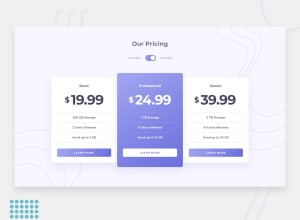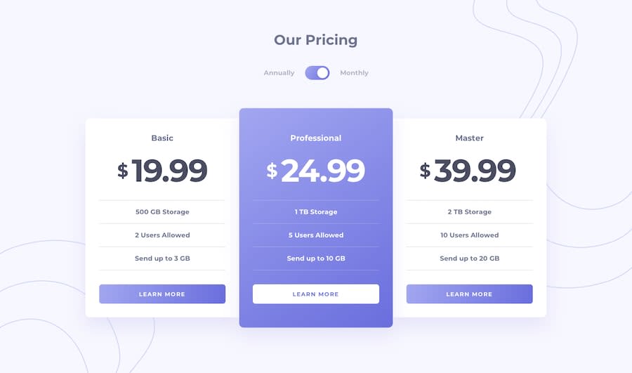
Design comparison
SolutionDesign
Solution retrospective
Any feedback would be much appreciated!
Community feedback
- @ApplePieGiraffePosted over 3 years ago
Hi there, again, Sandro! 👋
Didn't notice you completed another challenge! 😀 Nice work on this one! 🙌 Your site looks good and is responsive! 👍
One or two things I'd like to suggest are,
- Allowing users to change the prices on the pricing cards by clicking on the entire toggle-switch (not just the circle inside it) to make things a little easier for them.
- Adding some focused states to the various interactive elements of the page (such as the buttons) so that keyboard users can easily tell which elements are selected.
Of course, keep coding (and happy coding, too)! 😁
1@SanidethPosted over 3 years ago@ApplePieGiraffe Hey, thought you missed this one 😄 Thanks, I'll fix them
0
Please log in to post a comment
Log in with GitHubJoin our Discord community
Join thousands of Frontend Mentor community members taking the challenges, sharing resources, helping each other, and chatting about all things front-end!
Join our Discord
