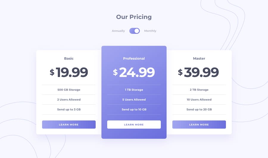
Design comparison
Solution retrospective
Ok, my first time attempting to push my code to Github through the terminal. I hope all transferred well. As always, any feedback is welcome.
Community feedback
- @mattstuddertPosted almost 5 years ago
Nice work, Adler! Seems that everything pushed OK, as the live version is working, but the Repo URL seems to be broken. You can update this by clicking the 3 vertical dots at the top right of this solution and selecting Edit Solution.
You've done a really good job on this challenge. My main piece of feedback would be to go through one last round of styling refinements. Your overall layout is great. But it would be well worth taking the time to really try and match up the styles to the design. For example, the font sizes are a little off and the borders and spacing on the feature items could be tweaked a little.
Let me know if you have any questions. Keep up the great work!
1@just-a-devguyPosted almost 5 years ago@mattstuddert thanks a bunch Matt for the feedback. I will update this and submit the new results.
0@just-a-devguyPosted almost 5 years ago@mattstuddert New code has been submitted. Please let me know thoughts.
0@mattstuddertPosted almost 5 years ago@adluders much better! You can see by the design comparison that there are still a few small differences. Training your eye to really see the detail is a key skill to build as a front-end developer, so it's time well spent trying to match up to the design. Good job!
1
Please log in to post a comment
Log in with GitHubJoin our Discord community
Join thousands of Frontend Mentor community members taking the challenges, sharing resources, helping each other, and chatting about all things front-end!
Join our Discord
