Design comparison
Community feedback
- @correlucasPosted about 2 years ago
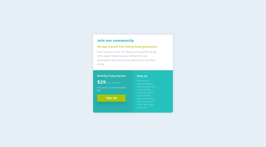
👾Hello @uzairK134, Congratulations on completing this challenge!
You’ve done really good work here putting everything together, I’ve some suggestions to improve the design:
1.Use the sequence h1 h2 h3 h4 h5 to show the hierarchy of your titles in level of importance, never jump a level.
2.Its not so good that you used
overflow: hiddenfor the whole content, in this case this property is making the content get cropped when the component gets tiny. Instead of usingoverflowto make the rounded borders useborder-radiusfor each card.3.Use units as
remoreminstead ofpxto improve your performance by resizing fonts between different screens and devices.To save your time you can code you whole page using
pxand then in the end use a VsCode plugin called px to rem heres the link → https://marketplace.visualstudio.com/items?itemName=sainoba.px-to-rem to do the automatic conversion or use this website https://pixelsconverter.com/px-to-rem✌️ I hope this helps you and happy coding!
Marked as helpful1 - @denieldenPosted about 2 years ago
Hi Uzair, congratulations on completing the challenge, great job! 😁
Some little tips for optimizing your code:
- remove
margin and widthfrom body - add
width: 45remto.containerclass - use
maintag to wrap the content of page and improve the Accessibility not as container of card - use
min-height: 100vhto body instead ofheight, otherwise the content is cut off when the browser height is less than the content - instead of using
pxuse relative units of measurement likerem-> read here
Hope this help! Happy coding 😉
Marked as helpful1 - remove
Please log in to post a comment
Log in with GitHubJoin our Discord community
Join thousands of Frontend Mentor community members taking the challenges, sharing resources, helping each other, and chatting about all things front-end!
Join our Discord
