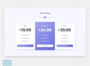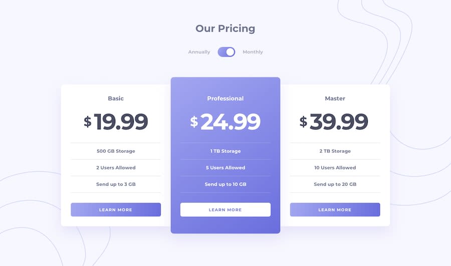
Design comparison
Solution retrospective
Hey, would someone review my JS code and tell me if there is a way that would be more effective than that. all the feedbacks on the design are appreciated as well 😁
Community feedback
- @zuolizhuPosted about 4 years ago
Hey Mustafa,
You work is very close to the design file and the switch button works well 👏!
From the design point of view, the
border-radiusof the cards could be bigger, I believe it was10pxon the sketch file. Thebox-shadowis also lighter,box-shadow: 0px 20px 40px rgba(212, 210, 244, 50%);will looks better.Your JS code looks nice and clean, however, you don't need to use
else ifsincethis.checkedonly have two values, either true or false.ifandelsewould be good enough.To make it even shorter
if (this.checked) {
        prices[0].textContent = annualPrices[0];
        prices[1].textContent = annualPrices[1];
        prices[2].textContent = annualPrices[2];
    } else {
        prices[0].textContent = monthlyPrices[0];
        prices[1].textContent = monthlyPrices[1];
        prices[2].textContent = monthlyPrices[2];
    }
Happy coding 🙌!
3@Mostafa-TPosted about 4 years ago@zuolizhu Thank you so much !! I really appreciate that you gave your self the time to review my code and give me a feedback. I will work on updating this project as soon as possible 😁
1
Please log in to post a comment
Log in with GitHubJoin our Discord community
Join thousands of Frontend Mentor community members taking the challenges, sharing resources, helping each other, and chatting about all things front-end!
Join our Discord
