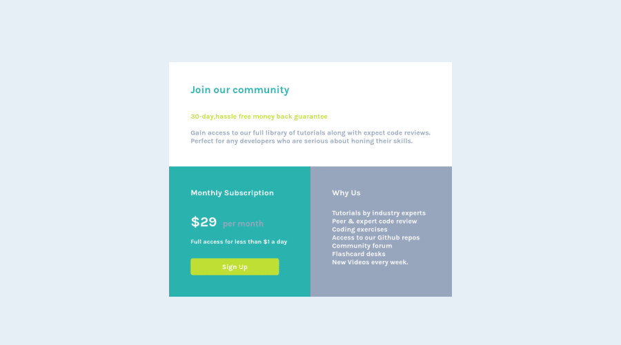
Price Component Page Using HTML & CSS
Design comparison
Solution retrospective
Hey This is the project which i have created using HTML & CSS with some flex properties.
Community feedback
- @vanzasetiaPosted over 1 year ago
Hi, there!
I notice two
<html>
elements in the HTML file. You should remove the second<html>
element. Then, specify thelang
attribute on the first<html>
element.You don't need to add
type="text/css"
on the stylesheet's link element.For the
.container
, I recommend using the<div>
instead of<header class="container">
. For styling purposes, it's better to use<div>
element.Remove all
<br>
elements. Screen readers may announce them as "break" which creates unnecessary noises. You should usemargin
orpadding
to create white space between elements. Learn more — <br>: The Line Break element - HTML: HyperText Markup Language | MDN #accessibility_concernsI hope you find this useful.
0 - @Ragu-The-DeveloperPosted over 1 year ago
here i dont know how i can create two cards with top card has same box how it is done by css what we have to use specific element?
0@vanzasetiaPosted over 1 year ago@Ragu-The-Developer
I don't understand your question.
For the specific element, there is no specific element. If it is only for styling purposes then you should use
<div>
element.For the layout of the card, you should use grid instead of flexbox. I recommend using this opportunity to learn and use grid.
0 - @0xabdulkhaliqPosted over 1 year ago
Hello there 👋. Congratulations on successfully completing the challenge! 🎉
- I have other recommendations regarding your code that I believe will be of great interest to you.
.
HEADINGS ⚠️:
- This solution had generated accessibility error report due to lack of level-one heading
<h1>
- Every site must want at least one
h1
element identifying and describing the main content of the page.
- An
h1
heading provides an important navigation point for users of assistive technologies, allowing them to easily find the main content of the page.
- So we want to add a level-one heading to improve accessibility by reading aloud the heading by screen readers, you can achieve this by adding a
sr-only
class to hide it from visual users (it will be useful for visually impaired users)
.
I hope you find this helpful 😄 Above all, the solution you submitted is great !
Happy coding!
0
Please log in to post a comment
Log in with GitHubJoin our Discord community
Join thousands of Frontend Mentor community members taking the challenges, sharing resources, helping each other, and chatting about all things front-end!
Join our Discord