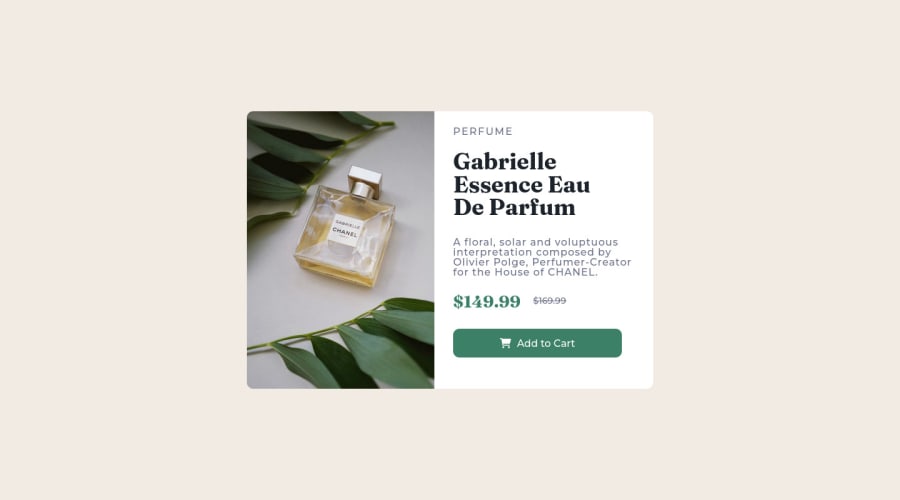
Preview-Card I just used flexbox to made this after a 6 months of rest


Design comparison

Solution retrospective
give me your opinion about this project and if there is something that needs to be edited i will be happy to hear from you!
Community feedback
- @kartardeveloperPosted over 2 years ago
Hey Beshoy, You did Great. But if you need some improvements I will help you with this. Here are some suggestions -- 1). You can use the line-height CSS property to give a space between text lines. Now the gap is too narrow. Now the text is looking a little bit ugly and messed up. After giving the gap you can see the changes. 2). Responsive is good. But you can increase your card width by a little in your mobile design. 3). You can use max-width and width properties on your card so that it will automatically be responsive on mobile. Everything else is looking good. I hope this will help you. If you need any help then I'm always there.👍
0

Please log in to post a comment
Log in with GitHubJoin our Discord community
Join thousands of Frontend Mentor community members taking the challenges, sharing resources, helping each other, and chatting about all things front-end!
Join our Discord