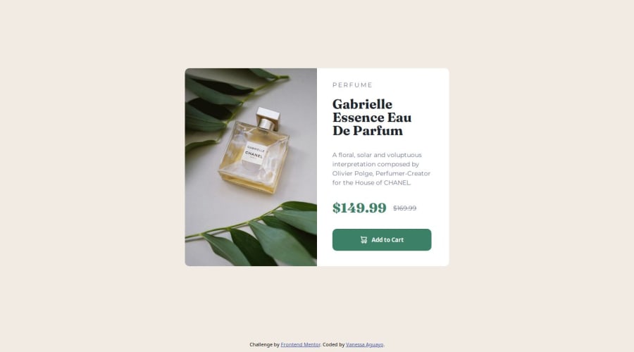
Preview Product Page using html and css for a responsive design


Design comparison

Community feedback
- @Shah-Faisal-cloudPosted 3 months ago
Nice Work!
Some improvements you may want to consider;
-
Instead of setting padding for each individual dimension (top, right, bottom, left), you can use the shorthand padding property to define all four values in one line, making your code cleaner and more efficient.
-
For smoother transitions, you might want to consider using the transition property, which allows changes in background-color (or other properties) to occur gradually over a specified duration.
-
It might be a good idea to set the max-width in the media query to be greater than the container's width and define a specific width for the container in the media query to avoid any potential overflow on smaller screens.
I think it could be worth considering.
0 -

Please log in to post a comment
Log in with GitHub
Join our Discord community
Join thousands of Frontend Mentor community members taking the challenges, sharing resources, helping each other, and chatting about all things front-end!
Join our Discord