Design comparison
Solution retrospective
UPDATE: RESOLVED! SOLUTION:
- deleted the "view" icon class from both html and css
- added to .overlay the below line: background:url("./images/icon-view.svg") no-repeat center hsla(178, 100%, 50%, 0.5);
/used hsla instead of hsl in order to add initial opacity/
- changed in .containerimage:hover .overlay -> opacity=1; This way the icon appears with full opacity while the background seems to be faded as the challenge required.
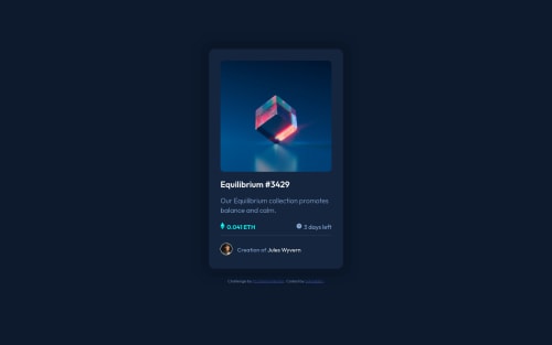
Hello! At it with my second challenge and I admit, the overlay effect on hover was challenging. As you can see I couldn't make the View icon at opacity 1 and it pulled the value from the opacity of the overlay:hover. Any thoughts and advices about this? Same goes with putting a text instead of the icon
Additional feedback on how I can make my code cleaner is highly appreciated! :)
Community feedback
- @BenjaDotMinPosted almost 3 years ago
Hello Adina! First off, great work with this, I think you have handled the spacing very well. Looking great.
Regarding your question, here is how I would handle the eye hover.
- Delete ".viewicon" img tag inside ".overlay"
- Delete the ".viewicon" css
- Change opacity:0.5 on ".containerimage:hover .overlay", to opacity:1
- On your ".overlay" class, add: background: url(./images/icon-view.svg) no-repeat center rgb(0 255 247 / 50%);
This should centre the eye, but also give you a transparent background. Apologies, I do not know what the exact colours are from the design, so I just guessed. You may be able to get it closer.
The issue you were having is due to that opacity is inherited by all children, whereas rgba is not inherited by children.
Also I notice on your ".overlay" class, you have: transform: 0.3s ease; This should be: transition: 0.3s ease; That should get your animation working.
This is all I have, but again good job!
Marked as helpful0@adinabbbPosted almost 3 years ago@BenjaDotMin
Hey Benja! While your solution didn't really give me the wanted end result to have only the icon on opacity 1 and the background overlay to opacity 0.5 I actually took a very good tip from you which is deleting the icon part from my html and writing it in the css file for a cleaner code.
Thank you!!
1@BenjaDotMinPosted almost 3 years ago@adinabbb My pleasure! Apologies, I must have misread what you wanted to achieve. But I am glad you got a take-away :)
It can be really nice to use background images, especially if you want to re-use an image many times or easily centre images, plus saving any extra lines of code. But just be wary, there is no alt for background images, so it depends on what support you need for screen readers etc.
Happy to help, and keep up the impressive work!
Marked as helpful0 - @IamparvesPosted almost 3 years ago
Hello @adinabbb, You did a great job.
For the overlay effect you can hide and show the overlay using
visibility
property instead of opacity. Since the eye icon is a child element of overlay div it's also becoming transparent. You can just make the background transparent using hsla color instead of hsl. And if you want to use transition with visibility property. You just need to make the opacity 0 in default state and 1 in hover state. Example:.overlay { visibility: hidden; background: hsla(178, 100%, 50%, .5); opacity: 0; transition: .3s ease; } .containerimage:hover .overlay { visibility: visible; opacity: 1; }
Marked as helpful0@adinabbbPosted almost 3 years ago@Iamparves
Hey Parves!
Thank you for your feedback; I actually combined your solution with Benja's below and created the WANTED EFFECT finally!! Thanks for pointing hsla to me, made things so much easier.
Regards, Adina
0
Please log in to post a comment
Log in with GitHubJoin our Discord community
Join thousands of Frontend Mentor community members taking the challenges, sharing resources, helping each other, and chatting about all things front-end!
Join our Discord