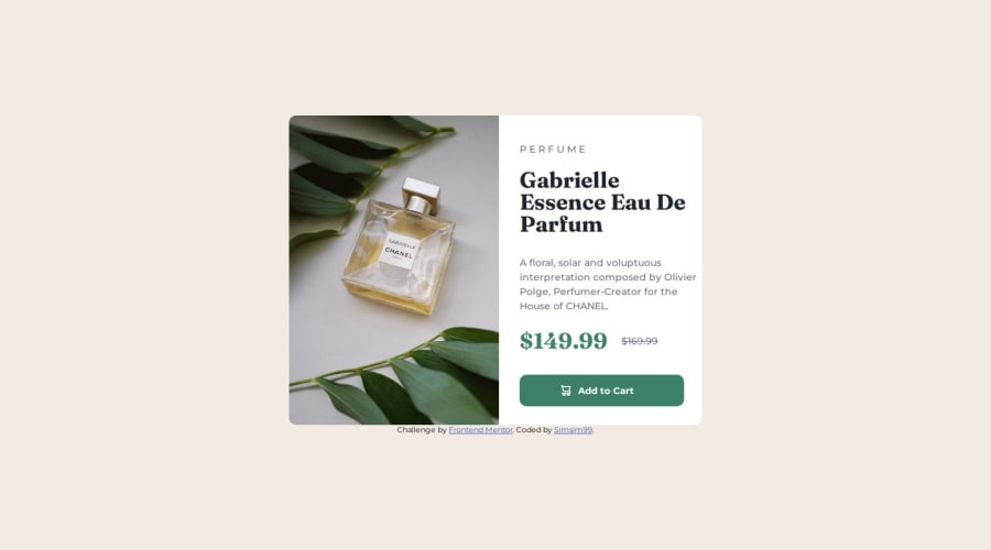
Design comparison
SolutionDesign
Solution retrospective
What are you most proud of, and what would you do differently next time?
im proud of the fact that i am learning, what i would do differently is not overthink stuff, i need to keep it simple to avoid wasting time!
What challenges did you encounter, and how did you overcome them?Starting with the phone layout first was confusing since it is my first time doing it, i really do not like doing mobile first but i have to. The picture element was another hurdle but after a couple of youtub vids explaining it, i managed to do it! I learned alot!
What specific areas of your project would you like help with?going from mobile to desktop layout
Community feedback
Please log in to post a comment
Log in with GitHubJoin our Discord community
Join thousands of Frontend Mentor community members taking the challenges, sharing resources, helping each other, and chatting about all things front-end!
Join our Discord
