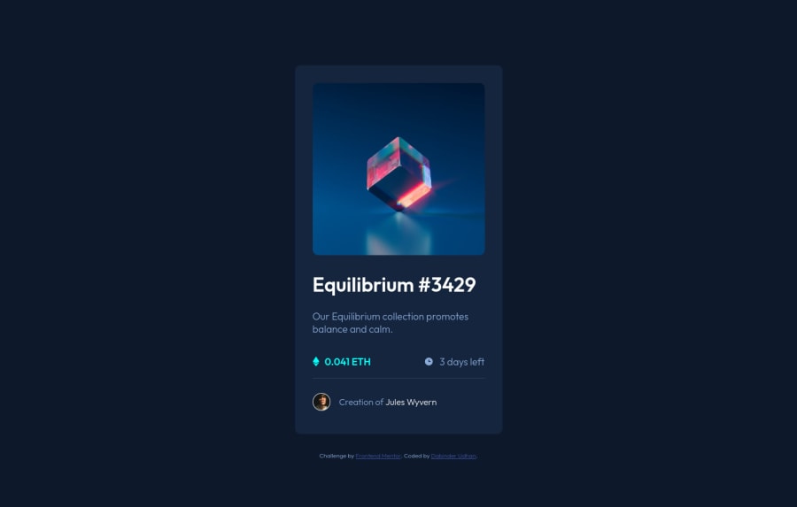
Design comparison
Community feedback
- @RioCantrePosted almost 3 years ago
Hello there! Great work with this one. Regarding the solution you submitted, I think you should also take notes of the following…
- Instead of
div, alternatively wrap the whole content withmainandfootertag forattribution. Use semantic tags, for HTML structures, refer it with this one Semantics - Adjust the height in the
.overlayrule set into99%
Above all, The design looks good. Keep it up!
Marked as helpful0 - Instead of
- @PhoenixDev22Posted almost 3 years ago
Hello @dabinderudhan,
I have some suggestions regarding your solution:
-
There should be two landmark components as children of the body element - a
main(which will be the NFT card ) and afooter(which will be the attribution).<Footer>should not be in the<main >. HTML5 landmark elements are used to improve navigation . -
For any decorative images, each img tag should have empty
alt=""andaria-hidden="true"attributes to make all web assistive technologies such as screen reader ignore those images in(icon-ethereum, icon-clock). -
<svg> 's do not add important information to a document should be considered decorative. You can usearia-hidden="true"to hide the SVG from screen readers.focusable="false"is also used to ensure Internet Explorer won’t allow the Tab key to navigate into the SVG.( of icon-view ) -
Anything with a hover style in design means it's interactive. you need to add an interactive element
<a>around the image,Equilibrium #3429 and Jules Wyvern. add hover effect on them . -
The avatar's alt shouldn't be
image-avatarit's meaningless , you can useJules Wyvernfor it. -
the link should be wrapping the main image and either have
Sr-onlytext, anaria-labeloralttext that says where that link takes you. -
You can use
<ul>to wrapclass="equilibrium-data"and in each<li>there would be<img>and <p>`` . -
the
icon-viewdoesn't really need to be in the html, you could do it with css. If you want it to stay in html it needs to be aria-hidden or role presentation with empty alt. -
I would use pseudo-elements to change the teal bg color to a hsla. Then opacity can be changed from 0 to 1 on the pseudo on hover as there is no reason to have the extra clutter in the html.
-
Use min-height: 100vh; instead of
height: 100vh/using vh (viewport height) units allows the body to to grow taller if the content outgrows the visible page./ -
You should use
emandremunits .Bothemandremare flexible, Usingpxwon't allow the user to control the font size based on their needs. Never use px for font-size.
Overall, your solution is good, Hopefully this feedback helps.
1 -
Please log in to post a comment
Log in with GitHubJoin our Discord community
Join thousands of Frontend Mentor community members taking the challenges, sharing resources, helping each other, and chatting about all things front-end!
Join our Discord
