Not Found
Request path contains unescaped characters
Not Found
Not Found
Not Found
Not Found
Not Found
Not Found
Not Found
Not Found
Not Found
Not Found
Not Found
Not Found
Not Found
Not Found
Not Found
Not Found
Not Found
Not Found

Submitted

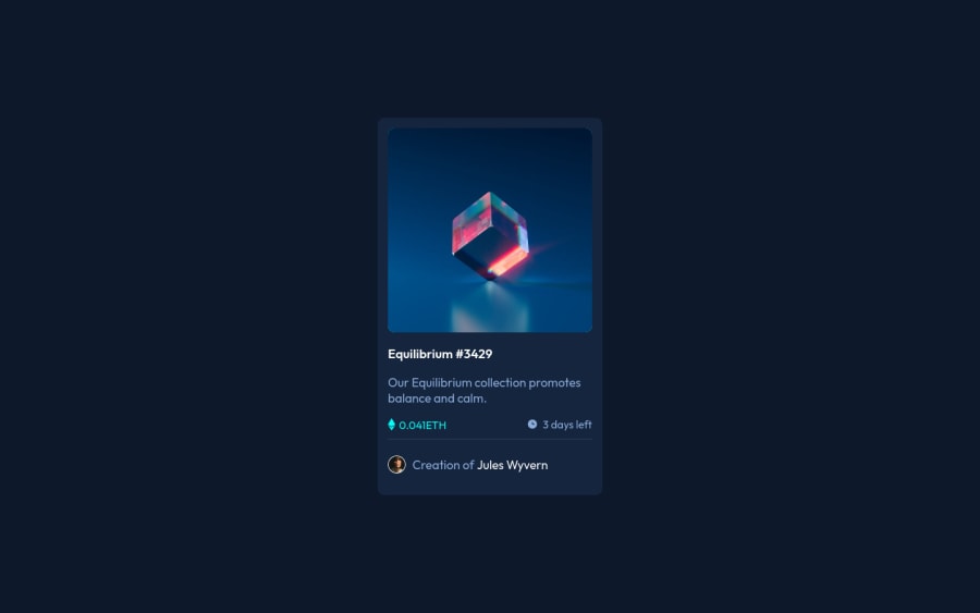
preview card using flex box and sass(first time using sass)

Mark Cates 110

@mscates

Desktop design screenshot for the NFT preview card component coding challenge

This is a solution for...

  • HTML
  • CSS
1newbie
View challenge

Design comparison


SolutionDesign

Solution retrospective


Hello, I am just curious about my html setup and the css organization that I used. also, first time using sass and I liked it. I used divs everywhere and I know that I should used more semantic html, but I am not sure what to use in each situation. also, for the css I am curious when to use a container and when it is not needed. could you provide some feedback on that. thank you very much.

update: I corrected all the accessibility issues I think and wrapped all the content in a main tag instead of a div container. also added some margin below the nft symbol and days remaining to more closely match the design.

Community feedback

@pikapikamart

Posted

Hey, awesome work on this one. The layout in general I think looks great.

David Turner already gave a feedback on this, just going to add some suggestions as well ( don't mind me re-iterating some points from David:> )

  • First, congrats on your first challenge here at FEM and I hope you find this fun to do and informative as well.
  • The reason for changing the .container tag to use main tag is because on a page, a main element is always needed. The main tag will contain the main-content of the site, this helps others users like screen-reader users to properly navigate and know information from landmark elements like the main tag.
  • Avoid using height: 100vh on a large container like the .container as this makes the element's height capped based on the viewport/screen's height. Instead use min-height: 100vh so that the element will expand if it needs to.
  • Whenever you make a component interactive one, then there must be an interactive element placed on it. For example, since if you hover on the image, there appears an overlay that have a preview-icon right, meaning that this image is could be interacted by the user, hence there should be something like a button , focusable elements like button, input, link are interactive elements. For this one, if you think that when clicking the image creates a modal or pop-up on the screen where you can see the full nft, then button would be nice, but if clicking the image redirects the user to another page, then a tag would fit better. I haven't made this challenge yet so I can't give a reference, but I hope you got some insights about interactivity.
  • For the nft image, since the nft's name is already present, then using that as the alt value for the img would be really nice like alt="equilibrium".
  • Since the preview-icon is just decorative, we want it to be hidden for screen-reader users. Normally when you use alt="" on an img, you want to add aria-hidden="true" attribute on the img tag as well so that the image will be complete hidden for screen-reader users.
  • Same for the nft name heading tag, it is being treated as an interactive element, you can use a tag inside the heading tag to wrap the text:
<h1> # use h1 since h1 is needed for every page
  <a href="#"> Equilibrium #3429 </a>
</h1>
  • You can as well use ethereum as the eth-icon's alt value since the currency is real though.
  • When wrapping up a text-content, make sure that it is inside a meaningful element like p tag or heading tag and not using like div, span to wrap the text.
  • For the person, since the person's name is present as well, using it on the img alt would be really nice.
  • Same as well for the person's name, it is being treated as interactive. Instead of span for the person's name, use a tag.

Aside from those, great job again on this one.

0

Mark Cates 110

@mscates

Posted

@pikapikamart thank you for the help. I made all the changes you requested. this will really help me with next challenge I am working on. feedback helps so much.

1
P
David Turner 4,150

@brodiewebdt

Posted

This looks very good. If you add the container styling to the body tag and change the container div to a Main tag it will clear the accessibility warnings. You also should change the Equilibrium H3 to an H1. every page should a level one heading for semantic reasons.

Download AXE DevTools and you can clear accessibility warnings while you code. https://www.deque.com/axe/devtools/

Hope this helps.

0

Please log in to post a comment

Log in with GitHub
Discord logo

Join our Discord community

Join thousands of Frontend Mentor community members taking the challenges, sharing resources, helping each other, and chatting about all things front-end!

Join our Discord