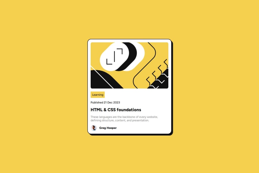
Preview Card using CSS variables and clamp()
Design comparison
Solution retrospective
I'm proud of using CSS variables and using clamp() to do the font-size challenge and keep the size of the card in check at different screen sizes. I think overall the structure of my CSS code is pretty neat.
I think there may be a better way to manage the size of the card. Overall, I really like how it turned out.
What challenges did you encounter, and how did you overcome them?The most challenging part was managing the aspect ratio of the card. I used clamp() to manage it. I should perhaps look into the aspect-ratio CSS property next time and see what I can do to manage the size and shape of these centered layouts better.
If I were to receive help, I think I'd like pointers relating to managing the size and shape of centered layouts like this one, and in the QR Code Component project.
Community feedback
- @nikogalvanPosted 9 months ago
I wanna learn BEM to, what resource do you recommend? . Btw this projects looks good, congrats
0@takinabradleyPosted 9 months ago@ramiroWeb
The BEM website is always a good place to look. Read through the whole site, it's pretty small: https://getbem.com/
Kevin Powell on youtube uses BEM in many of his videos. Watching him use it may help you rationalize how to use it yourself.
If you've touched something like React, where you create UI "components", I find that thinking of each "block" as a component you might make is useful litmus test for when you should create a new "block" identifier.
1
Please log in to post a comment
Log in with GitHubJoin our Discord community
Join thousands of Frontend Mentor community members taking the challenges, sharing resources, helping each other, and chatting about all things front-end!
Join our Discord
