

Design comparison
SolutionDesign

Community feedback
- P@jayco01Posted about 1 month ago
Hey Tomodachi! Your HTML is well-structured, and the use of CSS Grid and <picture> for image swapping is solid.
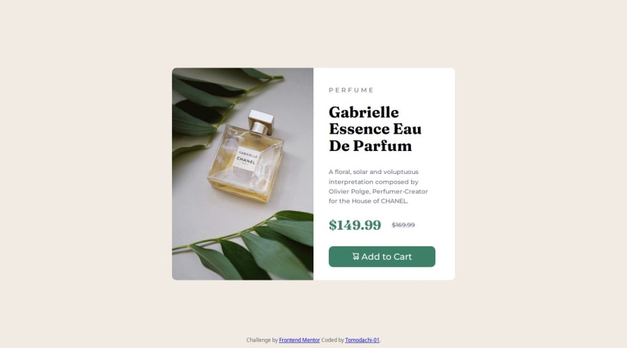
Main Issue: Mobile Layout Needs Fixing
- On mobile screens, the card stretches to full width and height, making it look unbalanced.
- The .box container should have a max-width and proper spacing to prevent it from taking up the entire viewport.
1@Tomodachi-01Posted about 1 month ago@jayco01 Yeah i know i tried to change it too many times but i am still stucked and thanks for the feedback man :)
0

Please log in to post a comment
Log in with GitHubJoin our Discord community
Join thousands of Frontend Mentor community members taking the challenges, sharing resources, helping each other, and chatting about all things front-end!
Join our Discord