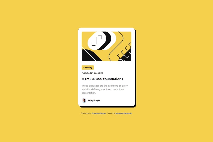
Preview Card created with HTML, CSS and Figma


Design comparison

Solution retrospective
Please feel free to let me know your thoughts on the code and anyway I can improve it. Thanks very much!
Community feedback
- P@Islandstone89Posted about 1 year ago
HTML:
-
Every webpage needs a
<main>that wraps all of the content, except for<header>andfooter>. This is vital for accessibility, as it helps screen readers identify the "main" section of a page. Change.containerto a<main>. -
Text should never be in divs alone. And you don't need to wrap every element in a
<div>, that is not needed. "Learning" is a<p>, "HTML & CSS" is a<h1>, and "Published" is also a<p>- make sure you wrap the date in a<time>tag, like so:<time datetime="2023-12-21">21 Dec 20223</time>. -
Never use words like "image" in the alt text. Screen readers would announce it as "image, image of man". Also, it needs to be more descriptive: "Headshot of Gary Hooper", for example.
-
.attributionshould be a<footer>, and its text must be wrapped in a<p>. Move the footer outside of the main, so they become siblings.
CSS:
-
It's good practice to include a CSS Reset at the top.
-
Add around
1remofpaddingon thebody, so the card doesn't touch the edges on small screens. -
On the
body, changeheighttomin-height- this way, the content will not get cut off if it grows beneath the viewport. Also, addflex-direction: columnandgap: 2rem. -
Move
font-familyto thebody, and remove it elsewhere. -
On
.container, removegap, it doesn't do anything withoutdisplay: flex. -
Move all the properties on
.containerto.card. -
Remove
margin-topon.attribution. The space between the card and the footer is created by thegap: 2remset on thebody. -
Remove the widths and heights on the card and on "Learning".
-
Add a
max-widthof around20remon the card, to prevent it from getting too wide on larger screens. -
font-sizemust never be in px. This is bad for accessibility, as it prevents the font size from scaling with the user's default setting in the browser. Use rem instead.
Marked as helpful0 -
- @Alokray007Posted about 1 year ago
Hello there 👋
Good job on completing the challenge !
Your project looks really good!
I have a suggestion about your code that might interest you.
There is an very useful browser extension called Perfect Pixel that allow you compare with the design image and thus see the exact dimensions. I recommend it to you.
📌 Tags like <div> and <span> are typical examples of non-semantic HTML elements. They serve only as content holders but give no indication as to what type of content they contain or what role that content plays on the page. This tag change does not impact your project visually and makes your HTML code more semantic, improving SEO optimization as well as the accessibility of your project.
I hope this suggestion is useful for future projects.
Other than that, great job!
Happy coding.
Marked as helpful0


Please log in to post a comment
Log in with GitHubJoin our Discord community
Join thousands of Frontend Mentor community members taking the challenges, sharing resources, helping each other, and chatting about all things front-end!
Join our Discord