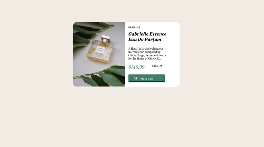
Design comparison
Solution retrospective
This is probably the second project I was working on initially, so I was kind of new to optimizing pages for mobile and desktop devices still. I think the biggest challenge on this one was just changing the dimensions of the product image to be able to fill in the containers for mobile and desktop view without it looking too scrunched up, and it was definitely a grind to reposition and modify the dimensions of the text and button elements. I was initially unsure of whether or not it was a good idea to use just one of the pictures included for both views, like I think I used the desktop image for both mobile and desktop views but after some tinkering I did find out that wasn't that big of a deal. One question I have about best practices I have now, even though I probably could've asked earlier- would it be better to set the min or max width to the precise pixel count of mobile or desktop devices, or is giving it some of the wiggle room perfectly fine like I've been doing? I've mostly been setting it to < or > 600px personally. Feel free to leave your suggestions or feedback with me!
Community feedback
- @SutonTochPosted over 1 year ago
Hello there, congrats on submitting the challenge.
Now, there is a lot to fix. First off: don't use
position: absolute;on everything. It's useful if you want to move for example an image outside of its box, but nothing else. What you effectively do withposition: absolute;is to remove the natural responsiveness of your webpage. You should use flexbox and/or grid. If you want to learn more about responsive layouts, I can personally recommend 'Conquering Responsive Layouts' by Kevin Powell. It's a free course and helped me a lot in the beginnings of my journey.Next, take your time. To be blunt, your submission is not even close to what it should be. If you need many more hours to make it look like the design, that's fine, but do it. Quality at your stage is much more important than quantity.
What to fix:
- Responsiveness: flexbox/grid instead of
position: absolute; - vertically center your component: also flexbox/grid
- correct font-color
- letter-spacing on 'PERFUME'
- heading and price shouldn't be italic
- border on the button
- use Semantic HTML (as in, the correct tags)
To your questions:
- use desktop-image for mobile? → Not a good idea. Mobile devices have to load a much bigger picture than what's necessary. If you have big webpages with many more images and a slow internet connection, it will be noticeable and impact user experience.
- what breakpoints for media queries? → Well.. there is no clear-cut answer here. Most people I've seen use the exact pixel values for specific devices. But there is a beautiful post on freecodecamp.org by David Gilbertson (https://www.freecodecamp.org/news/the-100-correct-way-to-do-css-breakpoints-88d6a5ba1862/) that actually suggests breakpoints like 600px, 900px, 1200px and 1800px. Therefore, your 600px are not wrong.
I'm very well aware that the Quality-to-Like-Ratio looks like a troll post. If so, congrats on wasting time. If not, good things take time, and that's true for everyone.
If you have any further questions, feel free to throw them my way.
Marked as helpful1 - Responsiveness: flexbox/grid instead of
Please log in to post a comment
Log in with GitHubJoin our Discord community
Join thousands of Frontend Mentor community members taking the challenges, sharing resources, helping each other, and chatting about all things front-end!
Join our Discord
