

Design comparison
SolutionDesign

Community feedback
- @orbdev1Posted 17 days ago
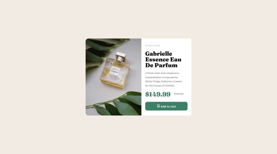
Hi Laize! Good job, these are my observations:
- Little detail on font text on name of product, is different, but is ok
- Need align correctly price and old price, same with cart (.svg) and 'Add to Card'.
- And resize from mobile to desktop, the breakpoint i think it will be 640px or less. 376px is tiny and in one moment the content does't display correctly
0

Please log in to post a comment
Log in with GitHubJoin our Discord community
Join thousands of Frontend Mentor community members taking the challenges, sharing resources, helping each other, and chatting about all things front-end!
Join our Discord