Not Found
Not Found
Not Found
Not Found
Not Found
Not Found
Not Found
Not Found
Not Found
Not Found
Not Found
Not Found
Not Found
Not Found
Not Found
Not Found
Not Found
Not Found
Not Found
Not Found

Submitted

Preview Card Component Using HTML and CSS

RavanCod 250

@vanessie2424

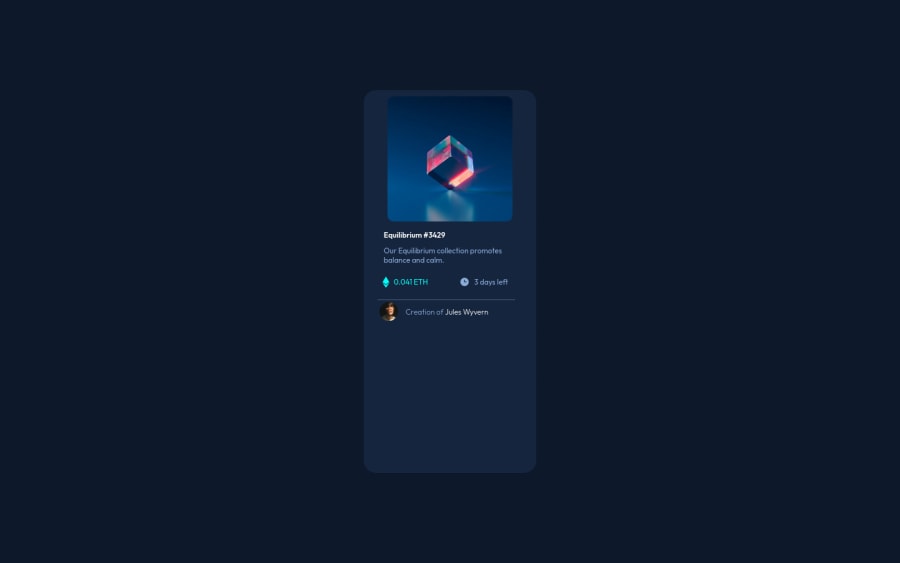
Desktop design screenshot for the NFT preview card component coding challenge

This is a solution for...

  • HTML
  • CSS
1newbie
View challenge

Design comparison


SolutionDesign

Solution retrospective


I'm sure there was a lot of manipulating involved in the code, LOL. If someone can tell me how I can do better, I will appreciate.

Community feedback

Hyron 5,870

@hyrongennike

Posted

Hi @vanessie2424,

Congrats on completing the challenge

Just a few suggestion, remove the min-height: 68vh on the .card and set the width of the images to 100%. Also increase the font size it's too small

Hope this is helpful.

Marked as helpful

0

RavanCod 250

@vanessie2424

Posted

@hyrongennike thank you.

0
Lucas 👾 104,420

@correlucas

Posted

👾Hello RavanCod, Congratulations on completing this challenge!

I saw your solution preview site and I think it's already really good. Here’s some tips for you to improve it:

To improve your component overall responsiveness, something you can do its to create a media query to save space in the pricing section to make each information in a different row. Here’s the code for this media query.

@media (max-width: 350px) {
.value {
    margin: 10px;
    display: flex;
    justify-content: space-between;
    align-items: center;
    flex-direction: column;
}
}

Note that there's no need to use height here, because since you set a height for an element, this means that this element will grow until a certain point and after that the inner content (as texts or images) will start to pop out the element due its fixed height, so isn't necessary to set the height the container height comes from the elements, its paddings and height.

.card {
    max-width: 300px;
    /* min-height: 68vh; */
    background: hsl(216, 50%, 16%);
    border-radius: 20px;
    padding: 10px;
}

✌️ I hope this helps you and happy coding!

0

RavanCod 250

@vanessie2424

Posted

@correlucas okay. Thanks. But to use the media query, do I need to remove any code order than the min-height: 68vh, and should I just use the media query under the rest of the code?

0
Lucas 👾 104,420

@correlucas

Posted

@vanessie2424 The media query will change your solution only after the max-width and you can write it separately of the other code writing only the properties that should change.

0

Please log in to post a comment

Log in with GitHub
Discord logo

Join our Discord community

Join thousands of Frontend Mentor community members taking the challenges, sharing resources, helping each other, and chatting about all things front-end!

Join our Discord