

Design comparison

Solution retrospective
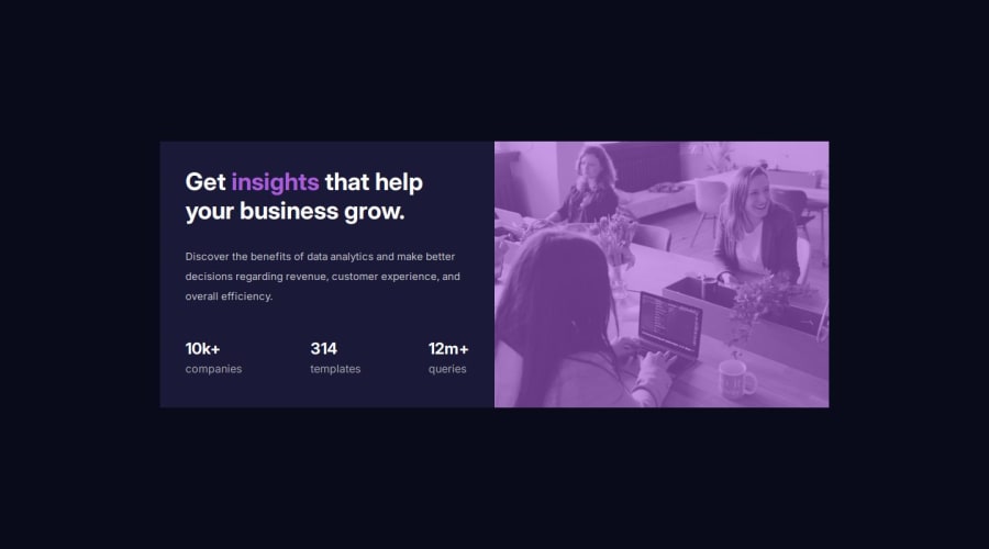
I’m most proud of how well the Stats Preview Card Component turned out visually and functionally. Implementing the image overlay effect with a soft violet tint using ::before felt particularly rewarding because it added depth to the design without additional assets.
If I were to revisit this project, I would compress images and explore CSS Grid for an even more flexible layout structure.
What challenges did you encounter, and how did you overcome them?Adding a violet overlay on the image while maintaining its responsive behavior was tricky. Ensuring the overlay aligned perfectly with the image required careful use of position: absolute and z-index.
What specific areas of your project would you like help with?I’d like guidance on making the project more accessible for users relying on assistive technologies. While I’ve used semantic HTML, I’m unsure if I’ve covered all accessibility best practices, such as proper ARIA roles or enhanced keyboard navigation.
Community feedback
Please log in to post a comment
Log in with GitHubJoin our Discord community
Join thousands of Frontend Mentor community members taking the challenges, sharing resources, helping each other, and chatting about all things front-end!
Join our Discord