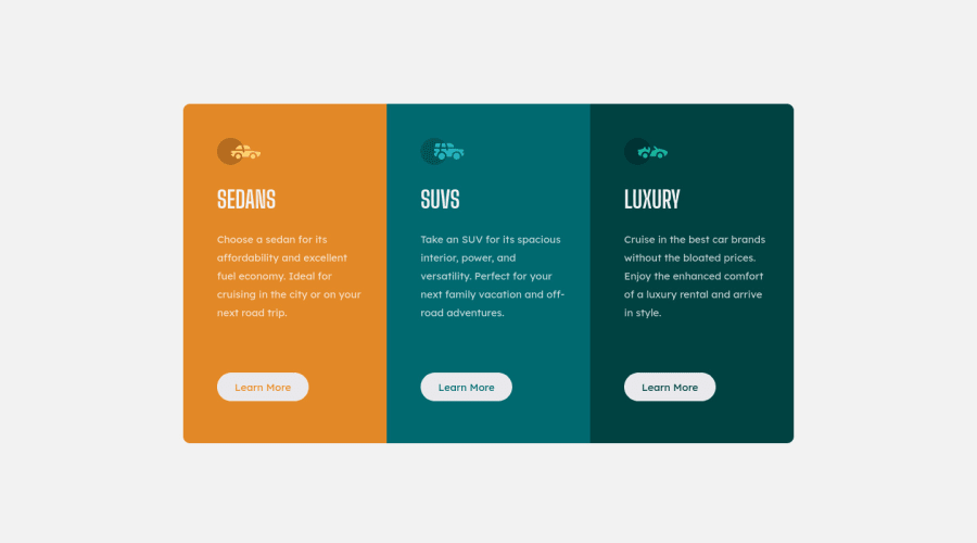
Design comparison
SolutionDesign
Solution retrospective
Hello there!
Since my last solution, I am feeling more confident, and I had less difficulty doing this challenge than in the last one. But, I know I have a lot to improve. So, any suggestions will be welcome.
Community feedback
- @FluffyKasPosted over 2 years ago
Hey, it looks great! The only thing I'd suggest is to remove the alt texts from the little car icons. They're decorative so they don't need to be announced by screen readers. An aria-hidden="true" would be better on them.
Marked as helpful0@victorCatharinaPosted over 2 years ago@FluffyKas Thank you, it was very helpful. Certainly, I'll follow your suggestion
0 - @Kamasah-DicksonPosted over 2 years ago
Good job your solution looks great on smaller devices
Good job Keep coding👍
0
Please log in to post a comment
Log in with GitHubJoin our Discord community
Join thousands of Frontend Mentor community members taking the challenges, sharing resources, helping each other, and chatting about all things front-end!
Join our Discord
