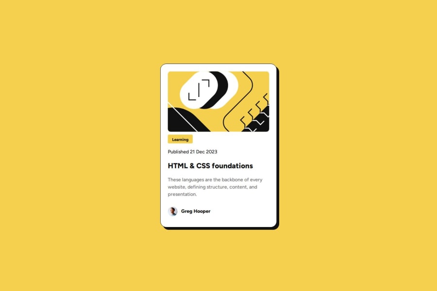
Design comparison
Solution retrospective
This was fun to create and I am feeling more confident in my css and html skills.
What challenges did you encounter, and how did you overcome them?A bit of research was needed for the border shadows and for placing the content on the page.
What specific areas of your project would you like help with?Some feedback on the way the content is centred on the page.
Community feedback
- @rkrhlikarPosted 3 months ago
Great job matching the box shadow and rounded edges!
A couple of things I noticed that make your implementation differ from the reference:
- You could give the illustration a bit more breathing room by adding some
margin-bottomto it. (Or use some other approach to add some spacing there.) - The publish date uses a different
colorvalue than the main paragraph in the reference but your implementation uses the same for both, making that section a bit too light. - The
font-sizeused for the title is significantly larger in your implementation. - You could give the main paragraph a larger
line-heightto space the lines a bit further apart. - Your card is both wider and taller than the reference, because the width and height of your
.containerare set explicitly to the full dimensions of the card in the reference. The reason for this discrepancy has to do with the way borders and padding are handled. The default behavior adds padding and border size to the defined width and height. You can read more about this in MDN's documentation for thebox-sizingCSS property. By playing around with this property you can get the browser to take padding and borders into account when you specify the size.
Related to the last point about sizing: you can leave the
heightunspecified and if you get the font sizes and spacing right the automatically determined height (based on the content height) should match the reference.Additionally, if you wanted to play around with making the card width responsive, reading about
min-widthandmax-widthis probably a good starting point.Looking at the Figma files provided with these Free+ challenges is a great way to see what the actual font sizes, colors and spacing values are which takes a lot of guess work out of getting your implementation looking pixel-perfect. Unfortunately the
style-guide.mddoesn't quite give you all of the information.I hope that the linked resources are helpful and not (too) overwhelming.
Good luck on the rest of your frontend development journey!
Marked as helpful0@RoxanaAnamariaTurcPosted 3 months ago@rkrhlikar Hey, thank you for the feedback , really great to receive so in depth advice. I saved the links and made some changes based on the feedback you gave :)
0 - You could give the illustration a bit more breathing room by adding some
Please log in to post a comment
Log in with GitHubJoin our Discord community
Join thousands of Frontend Mentor community members taking the challenges, sharing resources, helping each other, and chatting about all things front-end!
Join our Discord
