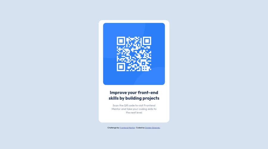
Design comparison
Solution retrospective
If you have any comments or suggestions on how I can improve, please kindly let me know :)
Community feedback
- @PhoenixDev22Posted over 2 years ago
Greeting @goldenekpendu,
I have few suggestions regarding your solution:
-
Use <main> to wrap the body content
<main class="container">) and afooter(which will be the attribution).<Footer>should be outside the`` <main >` . HTML5 landmark elements are used to improve navigation . -
To tackle the accessibility issues, you can add a
<h1>withclass="sr-only"(Hidden visually, but present for assistive tech).
.sr-only { border: 0 !important; clip: rect(1px, 1px, 1px, 1px) !important; -webkit-clip-path: inset(50%) !important; clip-path: inset(50%) !important; height: 1px !important; margin: -1px !important; overflow: hidden !important; padding: 0 !important; position: absolute !important; width: 1px !important; white-space: nowrap !important; }-
Don't use <div> for meningful content .
-
min-height: 100vh;/using vh (viewport height) units to allow the body to set a minimum height value based upon the full height of the viewport.This also allows the body to to grow taller if the content outgrows the visible page./
-
width: 350px;an explicit width is not a good way . Remove the width from the main component and change it tomax widthinstead. That will let it shrink a little when it needs to. -
You should use
emandremunits .Bothemandremare flexible, Usingpxwon't allow the user to control the font size based on their needs.
Overall , your solution is good. Hopefully this feedback helps.
Marked as helpful1@goldenekpenduPosted over 2 years ago@PhoenixDev22 thanks a lot for your indepth feedback. I'll make the changes. Thanks again
1 -
- @RioCantrePosted over 2 years ago
Hello there! Awesome work with this project. Looking at your solution, I would like to suggest the following for you…
- Instead of
div, alternatively wrap the whole content withmaintag . Use semantic tags, for HTML structures, refer it with this one Semantics brcan be removed in theh2and.paragraphline and use padding or margin for the spacing.- Alternative is to use
ptag to wrap the sentence...
<div class="paragraph"> Scan the QR code to visit Frontend <br /> Mentor and take your coding skills to <br /> the next level </div> Into: <p class="paragraph"> Scan the QR code to visit Frontend <br /> Mentor and take your coding skills to <br /> the next level </p>- Wrap this line
<div class="attribution">withfootertag
Above all, the design is well implemented. Keep up the good work!
Marked as helpful1@goldenekpenduPosted over 2 years ago@RioCantre thanks. I'll take note of the changes to be made
0 - Instead of
- @GitHub-dev12345Posted over 2 years ago
Congratulation to complete the challenge ❤️👍 My small suggestion : 1.In Card design CSS Code Used this:
transform : scale(0.8); this property decrease the size of card. 😉
large size for increase the number of scale & small size for decrease the number of scale
And in image card design give the opacity less number like :- opacity : 0.5, 0.8.
I hope you find this helpful
0
Please log in to post a comment
Log in with GitHubJoin our Discord community
Join thousands of Frontend Mentor community members taking the challenges, sharing resources, helping each other, and chatting about all things front-end!
Join our Discord
