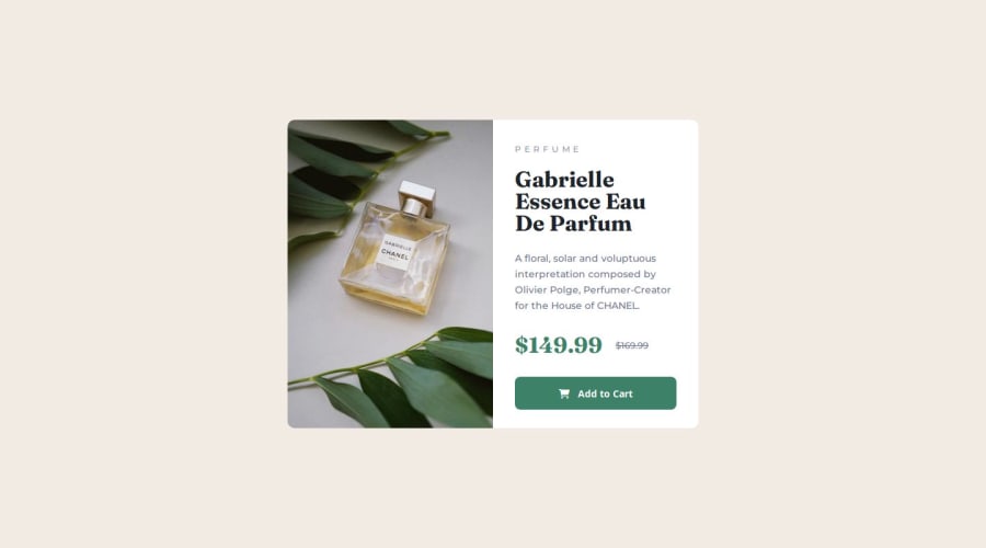
Design comparison
Solution retrospective
By improving my skills
What challenges did you encounter, and how did you overcome them?In the mobile version, there was a problem with placing the picture
What specific areas of your project would you like help with?I would like to learn more about stretching and centering pictures in a container
Please log in to post a comment
Log in with GitHubCommunity feedback
- @AdrianoEscarabote
Hi Sanya-Zg, how’s everything? I think your project turned out great! However, I have some feedback that I think might be useful:
Use the THE PICTURE TAG that is a shortcut to deal with the multiple images in this challenge. So you can use the
<picture>tag instead of importing this as an<img>or using a div withbackground-image. Use it to place the images and make the change between mobile and desktop, instead of using adivorimgand set the change in the css withdisplay: nonewith the tag picture is more practical and easy. Note that for SEO / search engine reasons isn’t a better practice import this product image with CSS since this will make it harder to the image. Manage both images inside the<picture>tag and use the html to code to set when the images should change setting the devicemax-widthdepending of the device desktop + mobile.Check the link for the official documentation for <picture> in W3 SCHOOLS: https://www.w3schools.com/tags/tag_picture.asp
See the example below:
<picture>
  <source media="(max-width:650px)" srcset="./images/image-product-mobile.jpg">
  <img src="./images/image-product-desktop.jpg" alt="Gabrielle Parfum" style="width:auto;">
</picture>
The rest is amazing.
I hope this is helpful. 👍
Marked as helpful - @AnneClr
pixel perfect ! well done !!
Join our Discord community
Join thousands of Frontend Mentor community members taking the challenges, sharing resources, helping each other, and chatting about all things front-end!
Join our Discord
