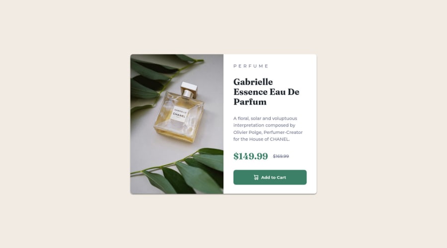
Design comparison
SolutionDesign
Solution retrospective
Good challenge for the beginner responsive web designers.
I completed this challenge using CSS FlexBox and Grid.
Any kind of suggestions regarding code or design are most appreciated. 🙂
Community feedback
- @MelvinAguilarPosted almost 2 years ago
Hello there 👋. Good job on completing the challenge !
I have some suggestions about your code that might interest you.
HTML 📄:
- The product image is not a decoration. You must not use the background-image property to add the product image. Instead, use the
<img>and<picture>tag to add the image. Use the background-image property only for decorative images that do not add any information to the page.
CSS 🎨:
- Instead of using pixels in font-size, use relative units like
emorrem. The font-size in absolute units like pixels does not scale with the user's browser settings. This can cause accessibility issues for users who have set their browser to use a larger font size. Source 📘.
- The
width: 100vwproperty in the.containertag is not necessary. This will create a horizontal scrollbar on some devices.
- Use
min-height: 100vhinstead ofheight: 100vh. Theheightproperty can cause your component to be cut off on small screens, such as a mobile phone in landscape mode.
I hope you find it useful! 😄
Happy coding!
Marked as helpful0 - The product image is not a decoration. You must not use the background-image property to add the product image. Instead, use the
Please log in to post a comment
Log in with GitHubJoin our Discord community
Join thousands of Frontend Mentor community members taking the challenges, sharing resources, helping each other, and chatting about all things front-end!
Join our Discord
