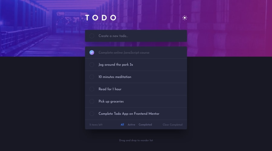
Design comparison
SolutionDesign
Community feedback
- @denieldenPosted over 2 years ago
Hi Paul, great work on this challenge! 😉
Here are a few tips for improve your code:
- i can add task also with blanks, add a control... The
trim()method can help you -> read here - add
maintag and wrap the content of page for improve the Accessibility - if i click clear completed it don't remove the first task done present in the app
- add
transitionon the swith theme dark/light - instead of using
px or %use relative units of measurement likerem-> read here
Overall you did well 😁 Hope this help!
Marked as helpful0@paulpdoaPosted over 2 years ago@denielden thanks for the advice sir! I will try to improve more :D
1 - i can add task also with blanks, add a control... The
Please log in to post a comment
Log in with GitHubJoin our Discord community
Join thousands of Frontend Mentor community members taking the challenges, sharing resources, helping each other, and chatting about all things front-end!
Join our Discord
