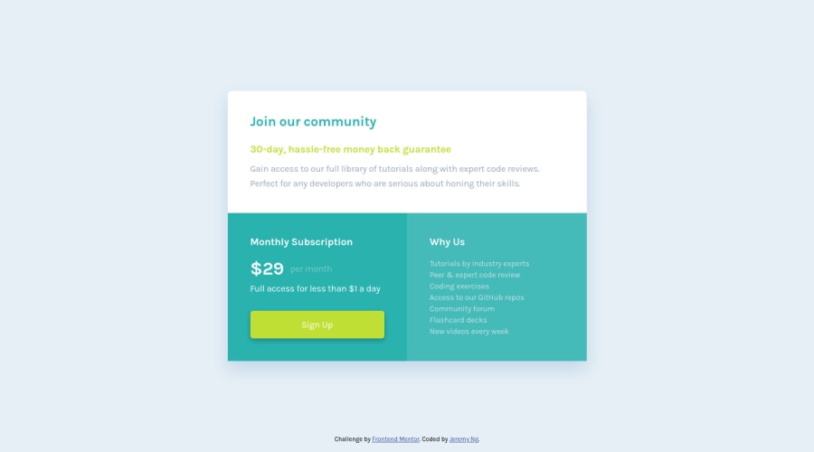
Practicing mobile-first SASS with BEM from Figma sketch v1.1
Design comparison
Solution retrospective
Update as of 1/31/2021:
- 0386156 2021-01-31 | style: changed all px units to rem (HEAD -> master, origin/master)
- 2dcb74f 2021-01-31 | refactor: shared style between cta and info headers
- 80c529c 2021-01-31 | chore: added vendor prefixes
- 761671e 2021-01-31 | style: sorted CSS properties by alphabetical order
- 23a149c 2021-01-31 | style: removed unused variables
- ec29072 2021-01-31 | refactor: removed the div wrapping around the main app and its associated styling and moved them back into .main-app
- add34b1 2021-01-31 | style: changed all uppercase references of CTA to lowercase
- ff33695 2021-01-31 | fix: removed hard coded height on the app so the app scales in height as new list items are added to Why Us section
- 312cf0c 2021-01-31 | refactor: moved list-style-type: none from the <ul> to the <li> in Why Us section
- 03ab619 2021-01-31 | fix: changed the why us section from a paragraph to a ul
Original post as of 1/30/2021:
-
I followed along using the Figma sketch file and it feels like cheating. They straight up have the CSS rules on the right side in Figma. It feels like cheating, is this how it's done on the job? Or have I been spending way more time than I should trying to figure out pixel perfect sizing and exact color values when that is really just sweating the small stuff and I am better off focusing on bigger concepts?
-
How is my BEM naming style? Are there places that I should be looking to substitute with element naming instead? Am I abusing the element naming scheme too much?
-
I didn't feel great about how I've centered my app using Flex as align-items: center didn't work so well when the app height > viewport height because then the top and bottom of the app got cut off. Any suggestions there?
Community feedback
- @mattstuddertPosted almost 4 years ago
Hey Jeremy, nice work on this challenge! Using the design file does feel a little bit like cheating, doesn't it! 😂 It is indeed how it's done on the job, so by using the design files, you'll be building up handy skills for when you get a job.
To answer your question about accuracy vs the design, I'd recommend reading this article by Josh Comeau about Chasing the pixel-perfect dream. It sums everything up very nicely! I'd definitely recommend getting the colours right. The exact sizings and spacings aren't always necessary, though. Your main role as a developer is to replicate the design as closely as possible while also writing high quality, maintainable code.
Your BEM naming is OK. I'd recommend keeping everything consistent, so no uppercasing classes like this one:
CTA__price
. Think about reusable classes as well. For example, the "Monthly Subscription" and "Why Us" headings have exactly the same styles. So these could be their own Block, as opposed to being elements within another block. Keep going with it. As you build more projects, you'll start to notice areas where you can optimise your code.For the vertical centring, you could set
min-height: 100vh;
on thebody
instead ofheight: 100%;
. This will ensure it's at least 100% the viewport height but will grow if the content is taller than the viewport. You could also get rid of the.main-wrapper
element as it's not doing anything that you couldn't do on the.main-app
element.One final thing regarding your HTML. In the "Why Us" area, that's a list of features/benefits. So a
ul
with list items makes more sense than no elements withbr
tags to break the lines.I hope this helps! Keep up the great work! 👍
2 - @lanechangerPosted almost 4 years ago
Thank you so much for taking the time out to check out my newbie solution Matt! I will take a look at that article.
That's a good point regarding the re-usable classes. I've been checking for it within each section but haven't checked for it across the different sections.
And ha, for the vertical centering, I was trying to do
height: min(100vh, 100%)
and trying to make that work before settling on using media query but duh, I should have been using themin-height
property!Thanks for the bonus advice about the listing, very good point. I will look out for those in the future!
0
Please log in to post a comment
Log in with GitHubJoin our Discord community
Join thousands of Frontend Mentor community members taking the challenges, sharing resources, helping each other, and chatting about all things front-end!
Join our Discord