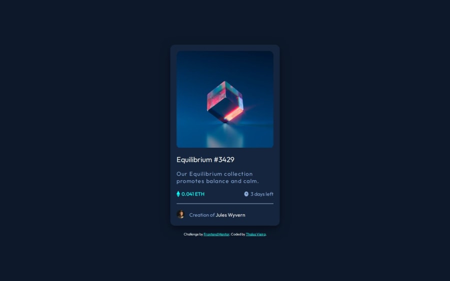
Practicing Flexbox with NFT Preview Card Component
Design comparison
Solution retrospective
For this project, I was most proud of how comfortable I was feeling with Flexbox proprieties. Next time I'd like to improve the way I get paddings and margins, I think it's too repetitive.
What challenges did you encounter, and how did you overcome them?The most challenging part for me was at the .produt-image hover. When the user hovers over the element it changes to image opacity, adds a background color, and shows an icon on top of the product image, so it's a little bit more complex and requires more attention and understanding of properties such as position, overflow, opacity, transition and the ::after selector.
What specific areas of your project would you like help with?I'd like some help to optimize the spacing between the elements and how can I make the line (hr element) thinner.
Community feedback
Please log in to post a comment
Log in with GitHubJoin our Discord community
Join thousands of Frontend Mentor community members taking the challenges, sharing resources, helping each other, and chatting about all things front-end!
Join our Discord
