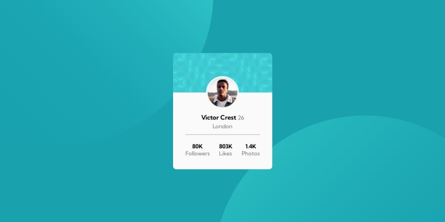
Practicing Flexbox skills with Profile Card Componet challenge!
Design comparison
Solution retrospective
Please, check out the read.me
in [my repository] (https://github.com/thaisavieira/profile-card-componet) where you can find more about my process how I built this project, and what I learned.
Do you have any tips about how can I make it even better?
Could the way I defined the spacings be done more cleanly?
Community feedback
- @HunigoleSanPosted 10 months ago
Hello @thaisavieira! 🌟 You're on the right track. Remember, continuous practice makes you a better developer. To solve the issue you're facing, you only need three lines of code:
ul { list-style: none; width: 100%; display: flex; justify-content: space-around; }
With this, you'll fix the problem you're encountering.
Now, let's discuss some recommendations to avoid bad practices.
First tip: Height 📏
The ".card" class is using a fixed measurement for the "heigh"t property. This could lead to issues as you add more child elements. It's best to avoid fixed measurements and let child elements naturally expand within the parent container.
Second tip: Width 📐
The ".card" class is using a fixed measurement for the "width" property, which might be suitable for mobile devices. However, for best practices, you could use the "padding-30px" property to increase the container size and simulate the appropriate width. Although, using a fixed measurement isn't necessarily wrong in this case.
Third tip: Responsive 📱
While you're not yet applying responsive design, you can make the ".card" class use a percentage instead of a fixed measurement for width. For example, "width: 95%". This will make the container fluid and adaptable to any type of mobile device with a screen width less than 415px.
I hope this little feedback has been able to help you in your professional development. 🌟 If you found it useful, feel free to rate it! Keep up the great work! 👍
Marked as helpful2@thaisavieiraPosted 10 months agoHello, @HunigoleSan! Thank you a lot! I applied the UL proprieties and it did solve my issue very well, but much more important than that I loved your tips. About the fixed measurement, it was always a doubt to me, causing some insecurities when I was starting a new practice project. I'm sure I'll keep these tips in my mind for my next studies. Keep inspiring and helping others!
0 - @danielmrz-devPosted 10 months ago
Olá @thaisavieira!
Seu projeto ficou ótimo!
O background com os círculos é um pouquinho chato de fazer, mas você pode criá-lo assim:
📌 Adicione isso ao
<body>
:background-color: var(--Dark-cyan); background-image: url("./images/bg-pattern-top.svg"), url("./images/bg-pattern-bottom.svg"); background-repeat: no-repeat, no-repeat; background-position: right 52vw bottom 35vh, left 48vw top 52vh;
Espero que ajude!
Fora isso, seu projeto está excelente!
Marked as helpful1@thaisavieiraPosted 10 months agoOlá, @danielmrz-dev! Muito obrigada pela dica com o background com os círculos, me ajudou muito com esse projeto e tenho certeza que me ajudará nos próximos.
1 - @paulo-xavierPosted 10 months ago
Olá @thaisavieira 👏
Parabéns pela conclusão do desafio! Você fez um ótimo trabalho. 😀
Para solucionar sua dúvida com relação ao espaçamento entre os elementos do
.account-info
, existe uma regra CSS chamadacolumn-gap
que é responsável pelo espaçamento entre colunas dos elementos, geralmente utilizada em casos onde você usa Flexbox.Para esse caso específico, você pode acessar a sua
ul
e aplicar o seguinte comando:ul { display: flex; column-gap: 30px; }
Você pode adaptar o valor do
column-gap
de acordo com sua preferência.Espero ter ajudado! Qualquer dúvida estou a disposição. Bons códigos 😀
Paulo Xavier
1@thaisavieiraPosted 10 months agoOlá, @paulo-xavier! Muito obrigada pela dica, gostei muito de conhecer a propriedade
column-gap
, tenho certeza que ela ainda será de muita utilidade nos próximos projetos.0 - @NantuePosted 10 months ago
Hello, @thaisavieira
Good job 👏
What you can do is place a "display: flex" to the "ul" and a gap of 50 pixels.
`ul {
list-style: none;
display: flex;
gap: 50px;
}`
1@thaisavieiraPosted 10 months agoHello, @Nantue! Thank you for the tip for solving my issue, it's really helpful!
0
Please log in to post a comment
Log in with GitHubJoin our Discord community
Join thousands of Frontend Mentor community members taking the challenges, sharing resources, helping each other, and chatting about all things front-end!
Join our Discord