Submitted 11 months ago
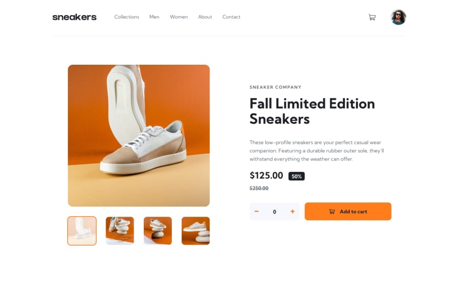
practice-25-Sneakers-react-redux
#react#redux
@SvitlanaSuslenkova
Design comparison
SolutionDesign
Solution retrospective
What challenges did you encounter, and how did you overcome them?
It was harder and longer then I expected..)
Community feedback
- @kass8mal8Posted 11 months ago
Good solution, it's nice you have taken the design a notch higher... Bravo 🎊
Just to note:
- In mobile your side navigation is scrolling on page scroll. You can position it as fixed when it is open to avoid the scrolling.
- The left arrow is above the side navigation, perhaps you could make the sidenav have a higher zIndex.
Marked as helpful0
Please log in to post a comment
Log in with GitHubJoin our Discord community
Join thousands of Frontend Mentor community members taking the challenges, sharing resources, helping each other, and chatting about all things front-end!
Join our Discord
