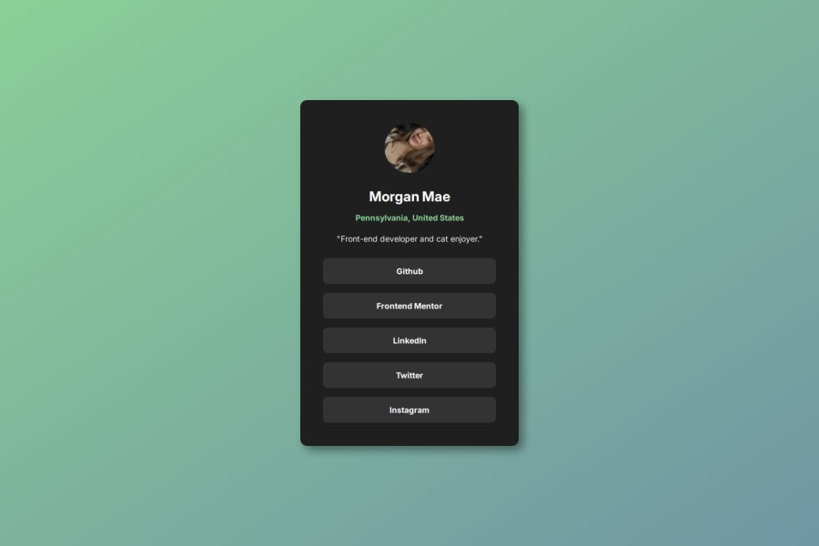


Design comparison

Solution retrospective
Proud of my use of Flexbox as I've been learning it recently and have been wanting to implement it more correctly in my code.
What specific areas of your project would you like help with?Please give feedback on my css flexbox and just my css in general! I'm trying to work on making sure my code will look good on all screens
Community feedback
- @adonmez04Posted 20 days ago
Hi Moe. Everything looks good. Here are some tips:
- You don't need
display: flexfor youraelements. You havetext-align: centerfor thebtn-listclass and it will center any text within it. - You also don't need
display: flexfor yourprofile-picclass. Give yourimgelementmargin-inline: autoand it will be centered within of the containing block. - Feel free to use
min-inline-sizefor the containing block. It avoids some broken UI elements. You can give your article elementmin-inline-size: 150px.
Actually, you don't need to use
display: flexfor this challenge. Everything is in the normal document flow that is from top to bottom. Try to code this challenge without using flex or grid and see when you should use flex or grid.Marked as helpful0 - You don't need
- @SortJakkePosted 21 days ago
Hello! Here are some suggestions to improve your project:
-
More semantic HTML: I would recommend replacing the article tag with the main tag and the divs with sections. This change will make your HTML code more semantic and eliminate an unnecessary tag. In the CSS, you can move the main tag declarations to the body for a cleaner and better-organized code structure.
-
CSS declarations: It's great that you used predefined declarations as it helps save time. However, I would remove unnecessary or unused declarations to avoid excess in your code.
-
Best practices: Even though it might not make a significant difference, removing unnecessary parts of the code is considered a good practice. It makes the page more readable, optimized, and easier to maintain in the future.
-
Additional suggestion: Since you designed this card to feel personal, enabling the GitHub and Frontend Mentor links would be a fun "easter egg." This would add an extra touch and make the user experience even more engaging.
Despite these suggestions, the final result looks fantastic! Comparing it with the original design, it seems the only differences are intentional, which shows your attention to detail. Congratulations on a job well done!
Marked as helpful0 -


Please log in to post a comment
Log in with GitHubJoin our Discord community
Join thousands of Frontend Mentor community members taking the challenges, sharing resources, helping each other, and chatting about all things front-end!
Join our Discord