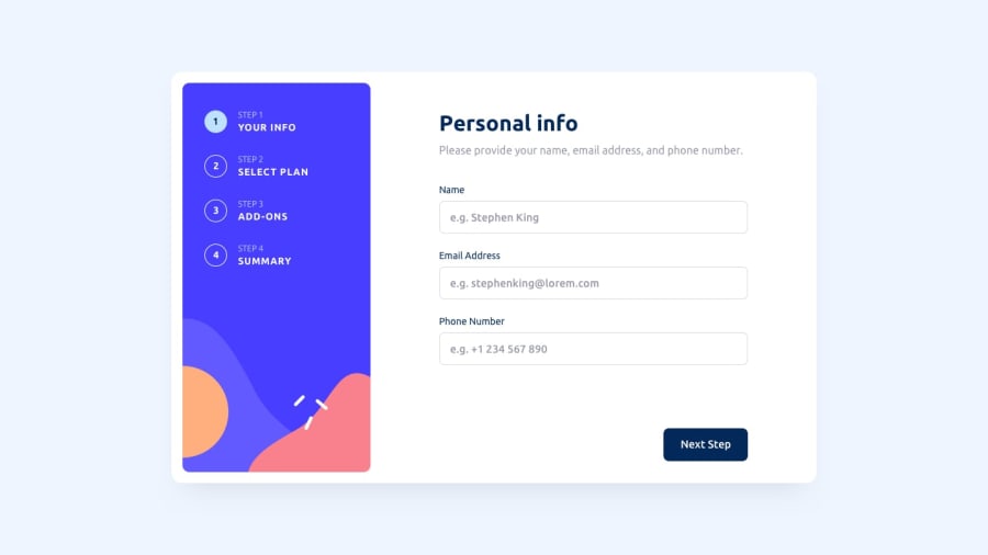
Design comparison
Solution retrospective
Circle numbers of steps work as buttons too. I thought that it can be useful.
What specific areas of your project would you like help with?Any advice?
Community feedback
- @MateuszSobiechPosted 2 months ago
Hi, good work. Consider to change state from booleans to number or string. I think it might simplify the code.
const [stepOne, setStepOne] = useState(true); const [stepTwo, setStepTwo] = useState(false); const [stepThree, setStepThree] = useState(false); const [stepFour, setStepFour] = useState(false);
type StepState = 1 | 2 | 3 | 4; const [step, setStep] = useState<StepState>(1); switch(step) { ... }
Marked as helpful1@SvitlanaSuslenkovaPosted 2 months ago@MateuszSobiech thanks, that's a good idea :)
1 - @emmanuelranonePosted 3 months ago
Hi, the design is very well done. The only thing that feels a bit off is that when the validation message 'StepOne_errorText__ABYh5' appears, it changes the spacing between the components. I would suggest finding a way to maintain consistent spacing at all times.
Regards !!
Marked as helpful0@emmanuelranonePosted 3 months ago@SvitlanaSuslenkova f.e. in 1920 x 1080... Only seen when "Phone number must contain + and 10 numbers" validation is enabled. But it is a detail, the rest is very nice.
0@SvitlanaSuslenkovaPosted 3 months ago@emmanuelranone thanks, it's solved. I cut it :D
0 - @tesla-ambassadorPosted 3 months ago
Hey! This is a beautiful solution... I'm thinking of doing it as my next challenge. The only problem I faced was with your phone number verification. It only accepts a + followed by 10 digits but my country code has two extra digits, making it 12. I think you could just increase the range of accepted number of digits to be from 10 - 12 digits.
Happy coding!
1@SvitlanaSuslenkovaPosted 3 months ago@tesla-ambassador thanks, I just made it as in the design, noone is going to put real number anyway :). Can I ask you a qestion. Have you already got a job as a frontend dev?
0@tesla-ambassadorPosted 3 months ago@SvitlanaSuslenkova I put my real number 😭. I haven't yet gotten a job cause I took time off to concentrate on finishing my bachelors... but I'm back at it and hopefully I'll get one soon!
0 - @dylan-dot-cPosted 28 days ago
Well done! You did great on this challenge and it all looks good. I'm not much of a pro so I can't give much valuable feedback. only thing I did realize was that for the addons step, each addon can be focused twice(once for the button and second for the input:checkbox) maybe you could make the label the entire wrapper instead of the button, but im not too sure. Overall you did good and you could also remove code comments to make ur code look cleaner.
I also did this challenge with React along with tailwindCSS, Framemotion and Zustand for state management, would love if you could check it out and give me some feedback(it's not perfect)
0@SvitlanaSuslenkovaPosted 28 days ago@dylan-dot-c about the addons - don't see any problem. Easy to click, no need to search for checkbox. For your case - yes it works for words, but not for white space inside the border. How should the client know about it? They don't know about "label".
0
Please log in to post a comment
Log in with GitHubJoin our Discord community
Join thousands of Frontend Mentor community members taking the challenges, sharing resources, helping each other, and chatting about all things front-end!
Join our Discord