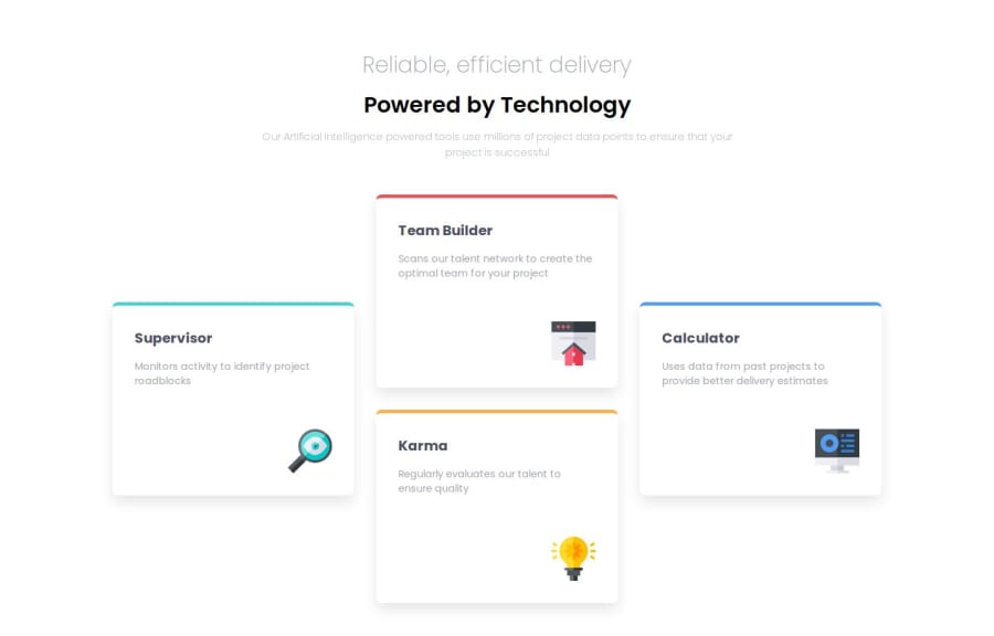
Design comparison
Community feedback
- @stezorPosted 4 months ago
Hi.
There's not much to say when it comes to final solution. Looks good to me.
Two things when it comes to code.
Maybe it's good idea to use h1 and h2 tags inside of the section u named texts instead of h1 and h1. Even tho they are same size in design, I think semantically they aren't of equal importance.
Also inside css if u use bem convention it becomes more descriptive and therefor easier to read and understand.
1 - @AdrianoEscarabotePosted 4 months ago
Hello Ounaio, how are you? I was really pleased with your project, but I’d like to offer some advice that might help:
<h1 >Reliable, efficient delivery</h1>
<h1 >Powered by Technology</h1>
The most appropriate in this case would be just an h1 tag! containing the two contents, to make them break a line, we can use a max-width, and for the styling we can use a span element with the content that will be changed!
The main tag must be present in every HTML document so that we can recognize the main content. To fix this, wrap the main content in the main tag. Users of assistive technology will have a better navigation experience on your site thanks to the use of HTML5 landmark elements.
The rest is spot on.
Hope it’s helpful to you. 👍
0
Please log in to post a comment
Log in with GitHubJoin our Discord community
Join thousands of Frontend Mentor community members taking the challenges, sharing resources, helping each other, and chatting about all things front-end!
Join our Discord
