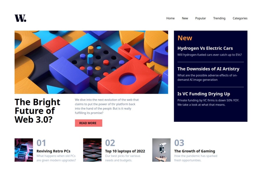
Design comparison
Solution retrospective
That's great! For your web accessibility page, you can reflect on things like making sure the page is easy to navigate for people with disabilities, ensuring good color contrast, or using semantic HTML.
To answer the question, you could say:
What you're most proud of: "I'm proud of making the page easy to use with screen readers by applying WAI-ARIA roles correctly and ensuring keyboard navigation works smoothly." What you'd do differently: "Next time, I would spend more time testing with real users who rely on assistive technologies to find any areas that could be improved." Would you like help with specific parts of the accessibility page?
What challenges did you encounter, and how did you overcome them?To answer the question "What challenges did you encounter, and how did you overcome them?" for your web accessibility page, you could consider the following:
Challenges you encountered: Think about any difficulties you faced while making the page accessible. For example:
Ensuring proper keyboard navigation. Using WAI-ARIA attributes correctly. Managing color contrast for readability. Testing the page with screen readers or other assistive technologies. How you overcame them: Explain the steps you took to solve these challenges. For example:
Researching and applying best practices for WAI-ARIA roles. Using online tools to check color contrast ratios. Testing your page with accessibility tools or getting feedback from others. Would you like help detailing any specific challenge you encountered while working on the accessibility page?
What specific areas of your project would you like help with?For this question, focus on particular parts of your web accessibility page where you feel unsure or need improvement. Being specific will help others give you useful feedback. Here are some examples you can consider:
Keyboard navigation: "I want to make sure my page is fully accessible via keyboard. Can anyone suggest improvements or tips on how to enhance this?"
Screen reader support: "I’ve used WAI-ARIA roles on custom elements, but I’m not sure if they are correctly applied for screen readers. Could someone review this part of my code?"
Color contrast: "I’ve tried to follow contrast guidelines, but I’m unsure if my color choices are accessible enough. Any feedback or suggestions for improvement?"
Form accessibility: "I’ve added labels and field descriptions to my forms, but I’m not sure if they are fully accessible. Can anyone test or review them?"
Would you like help drafting specific questions for your project?
Join our Discord community
Join thousands of Frontend Mentor community members taking the challenges, sharing resources, helping each other, and chatting about all things front-end!
Join our Discord
