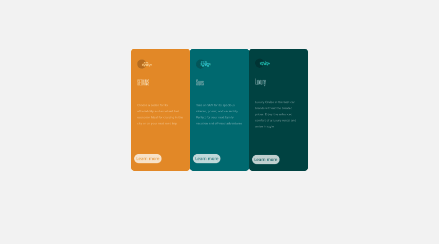
positioning of the columns using css grid and flex
Design comparison
Solution retrospective
Did you have any problems building the site?
Community feedback
- @correlucasPosted over 2 years ago
👾Hello @Ferexy, congratulations for your new solution!
Your solution is already good, the structure is good done. You can fix some aspects of your solution, for example, only the first and the third card have a
border-radiusyou need to remove it from the center card, to improve the semantics you can use in the place ofdivreplace with<article>.👨💻 Here's my solution for this challenge if you wants to see how I build it: https://www.frontendmentor.io/solutions/3-column-preview-card-vanilla-css-custom-design-and-hover-states-e5uAfmUT71
👋 I hope this helps you and happy coding!
Marked as helpful1 - @PhoenixDev22Posted over 2 years ago
Hello Olusola oluwaferanmi,
Congratulation on completing this challenge. Excellent work! I have few suggestions regarding your solution, if you don't mind:
HTML
- In this challenge, the images are much likely to be decorative. For any decorative images, each img tag should have empty
alt=""andaria-hidden="true"attributes to make all web assistive technologies such as screen reader ignore those images.
- What would happen when the user click those learn more? In my opinion, clicking those "learn more" would likely trigger navigation not do an action so input elements with type submit would not be right. So you should use the
<a>.
Aside these, great work on his one. Hopefully this feedback helps.
Marked as helpful0@FerexyPosted over 2 years ago@PhoenixDev22 Thank you very much, i will work on the corrections.
1 - In this challenge, the images are much likely to be decorative. For any decorative images, each img tag should have empty
Please log in to post a comment
Log in with GitHubJoin our Discord community
Join thousands of Frontend Mentor community members taking the challenges, sharing resources, helping each other, and chatting about all things front-end!
Join our Discord
