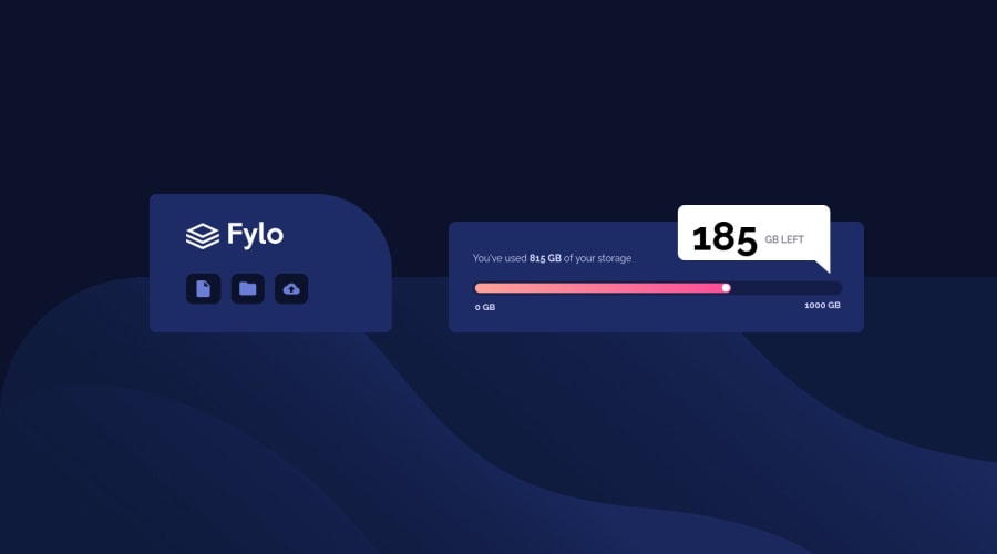
Design comparison
Solution retrospective
A little tricky, but at least it looks good on mobile and tablets . Made some changes, solving design problems. Thank you for comments.
Please log in to post a comment
Log in with GitHubCommunity feedback
- @MishaHernandez
Hello TrakaMeitene. Looks great, good job. 👋
I would recommend that in your
* {...}formatting rules you always usebox-sizing: border-box, so that margins and padding do not affect the size of your boxes.Always avoid using ID's, especially if your design doesn't use javascript. In similar elements, for example the three icons: file, folder and cloud, you could use pseudoclasses to select each one.
Sometimes the use of
clip-pathcan be replaced by something simpler like a correctly positioned geometric figure. For example the.sturiselement could be a semi-hidden triangle in the pop-up message.The font family should be assigned in the
bodyso that all elements inherit it and not have to repeat this property in several rules.Greetings, and continue with the challenges 👍
Join our Discord community
Join thousands of Frontend Mentor community members taking the challenges, sharing resources, helping each other, and chatting about all things front-end!
Join our Discord
